Interactive Visualizations
This is the 3rd chapter of the Dash Fundamentals.
The previous chapter covered basic callback usage. The next chapter describes how to share data between callbacks. Just getting started? Make sure to install the necessary dependencies.
The Dash Core Components (dash.dcc) module includes a Graph component called dcc.Graph.
dcc.Graph renders interactive data visualizations using the open source plotly.js JavaScript graphing library. Plotly.js supports over 35 chart types and renders charts in both vector-quality SVG and high-performance WebGL.
The figure argument in the dcc.Graph component is the same figure argument that is used by plotly.py.
Check out the plotly.py documentation and gallery to learn more.
As we already saw, Dash components are described by a set of attributes.
Any of these attributes can be updated by callback functions, but only
a subset of these attributes are updated through user interaction, such as
typing inside a dcc.Input component or clicking an option
in a dcc.Dropdown component.
The dcc.Graph component has four attributes that can change
through user-interaction: hoverData, clickData, selectedData,
relayoutData. These properties update when you hover over points, click on points, or
select regions of points in a graph.
Here’s an example that prints these attributes to the screen.
Show code
Show code
from dash import Dash, dcc, html, Input, Output, callback

import plotly.express as px

import json
import pandas as pd

external_stylesheets = ['https://codepen.io/chriddyp/pen/bWLwgP.css']

app = Dash(__name__, external_stylesheets=external_stylesheets)

styles = {
    'pre': {
        'border': 'thin lightgrey solid',
        'overflowX': 'scroll'
    }
}

df = pd.DataFrame({
    "x": [1,2,1,2],
    "y": [1,2,3,4],
    "customdata": [1,2,3,4],
    "fruit": ["apple", "apple", "orange", "orange"]
})

fig = px.scatter(df, x="x", y="y", color="fruit", custom_data=["customdata"])

fig.update_layout(clickmode='event+select')

fig.update_traces(marker_size=20)

app.layout = html.Div([
    dcc.Graph(
        id='basic-interactions',
        figure=fig
    ),

    html.Div(className='row', children=[
        html.Div([
            dcc.Markdown("""
                **Hover Data**

                Mouse over values in the graph.
            """),
            html.Pre(id='hover-data', style=styles['pre'])
        ], className='three columns'),

        html.Div([
            dcc.Markdown("""
                **Click Data**

                Click on points in the graph.
            """),
            html.Pre(id='click-data', style=styles['pre']),
        ], className='three columns'),

        html.Div([
            dcc.Markdown("""
                **Selection Data**

                Choose the lasso or rectangle tool in the graph's menu
                bar and then select points in the graph.

                Note that if `layout.clickmode = 'event+select'`, selection data also
                accumulates (or un-accumulates) selected data if you hold down the shift
                button while clicking.
            """),
            html.Pre(id='selected-data', style=styles['pre']),
        ], className='three columns'),

        html.Div([
            dcc.Markdown("""
                **Zoom and Relayout Data**

                Click and drag on the graph to zoom or click on the zoom
                buttons in the graph's menu bar.
            """),
            html.Pre(id='relayout-data', style=styles['pre']),
        ], className='three columns')
    ])
])


@callback(
    Output('hover-data', 'children'),
    Input('basic-interactions', 'hoverData'))
def display_hover_data(hoverData):
    return json.dumps(hoverData, indent=2)


@callback(
    Output('click-data', 'children'),
    Input('basic-interactions', 'clickData'))
def display_click_data(clickData):
    return json.dumps(clickData, indent=2)


@callback(
    Output('selected-data', 'children'),
    Input('basic-interactions', 'selectedData'))
def display_selected_data(selectedData):
    return json.dumps(selectedData, indent=2)


@callback(
    Output('relayout-data', 'children'),
    Input('basic-interactions', 'relayoutData'))
def display_relayout_data(relayoutData):
    return json.dumps(relayoutData, indent=2)


if __name__ == '__main__':
    app.run(debug=True)
Hover Data
Mouse over values in the graph.
Click Data
Click on points in the graph.
Selection Data
Choose the lasso or rectangle tool in the graph’s menu
bar and then select points in the graph.
Note that if layout.clickmode = 'event+select', selection data also
accumulates (or un-accumulates) selected data if you hold down the shift
button while clicking.
Zoom and Relayout Data
Click and drag on the graph to zoom or click on the zoom
buttons in the graph’s menu bar.
For optimal user interaction and chart loading performance, Dash apps
in production should consider the Job Queue,
HPC, Datashader,
and horizontal scaling capabilities of Dash Enterprise.
Update Graphs on Hover
Let’s update our world indicators example from the previous chapter by updating the time series when we hover over points in our scatter plot.
Show code
Show code
from dash import Dash, html, dcc, Input, Output, callback
import pandas as pd
import plotly.express as px

external_stylesheets = ['https://codepen.io/chriddyp/pen/bWLwgP.css']

app = Dash(__name__, external_stylesheets=external_stylesheets)

df = pd.read_csv('https://plotly.github.io/datasets/country_indicators.csv')


app.layout = html.Div([
    html.Div([

        html.Div([
            dcc.Dropdown(
                df['Indicator Name'].unique(),
                'Fertility rate, total (births per woman)',
                id='crossfilter-xaxis-column',
            ),
            dcc.RadioItems(
                ['Linear', 'Log'],
                'Linear',
                id='crossfilter-xaxis-type',
                labelStyle={'display': 'inline-block', 'marginTop': '5px'}
            )
        ],
        style={'width': '49%', 'display': 'inline-block'}),

        html.Div([
            dcc.Dropdown(
                df['Indicator Name'].unique(),
                'Life expectancy at birth, total (years)',
                id='crossfilter-yaxis-column'
            ),
            dcc.RadioItems(
                ['Linear', 'Log'],
                'Linear',
                id='crossfilter-yaxis-type',
                labelStyle={'display': 'inline-block', 'marginTop': '5px'}
            )
        ], style={'width': '49%', 'float': 'right', 'display': 'inline-block'})
    ], style={
        'padding': '10px 5px'
    }),

    html.Div([
        dcc.Graph(
            id='crossfilter-indicator-scatter',
            hoverData={'points': [{'customdata': 'Japan'}]}
        )
    ], style={'width': '49%', 'display': 'inline-block', 'padding': '0 20'}),
    html.Div([
        dcc.Graph(id='x-time-series'),
        dcc.Graph(id='y-time-series'),
    ], style={'display': 'inline-block', 'width': '49%'}),

    html.Div(dcc.Slider(
        df['Year'].min(),
        df['Year'].max(),
        step=None,
        id='crossfilter-year--slider',
        value=df['Year'].max(),
        marks={str(year): str(year) for year in df['Year'].unique()}
    ), style={'width': '49%', 'padding': '0px 20px 20px 20px'})
])


@callback(
    Output('crossfilter-indicator-scatter', 'figure'),
    Input('crossfilter-xaxis-column', 'value'),
    Input('crossfilter-yaxis-column', 'value'),
    Input('crossfilter-xaxis-type', 'value'),
    Input('crossfilter-yaxis-type', 'value'),
    Input('crossfilter-year--slider', 'value'))
def update_graph(xaxis_column_name, yaxis_column_name,
                 xaxis_type, yaxis_type,
                 year_value):
    dff = df[df['Year'] == year_value]

    fig = px.scatter(x=dff[dff['Indicator Name'] == xaxis_column_name]['Value'],
            y=dff[dff['Indicator Name'] == yaxis_column_name]['Value'],
            hover_name=dff[dff['Indicator Name'] == yaxis_column_name]['Country Name']
            )

    fig.update_traces(customdata=dff[dff['Indicator Name'] == yaxis_column_name]['Country Name'])

    fig.update_xaxes(title=xaxis_column_name, type='linear' if xaxis_type == 'Linear' else 'log')

    fig.update_yaxes(title=yaxis_column_name, type='linear' if yaxis_type == 'Linear' else 'log')

    fig.update_layout(margin={'l': 40, 'b': 40, 't': 10, 'r': 0}, hovermode='closest')

    return fig


def create_time_series(dff, axis_type, title):

    fig = px.scatter(dff, x='Year', y='Value')

    fig.update_traces(mode='lines+markers')

    fig.update_xaxes(showgrid=False)

    fig.update_yaxes(type='linear' if axis_type == 'Linear' else 'log')

    fig.add_annotation(x=0, y=0.85, xanchor='left', yanchor='bottom',
                       xref='paper', yref='paper', showarrow=False, align='left',
                       text=title)

    fig.update_layout(height=225, margin={'l': 20, 'b': 30, 'r': 10, 't': 10})

    return fig


@callback(
    Output('x-time-series', 'figure'),
    Input('crossfilter-indicator-scatter', 'hoverData'),
    Input('crossfilter-xaxis-column', 'value'),
    Input('crossfilter-xaxis-type', 'value'))
def update_x_timeseries(hoverData, xaxis_column_name, axis_type):
    country_name = hoverData['points'][0]['customdata']
    dff = df[df['Country Name'] == country_name]
    dff = dff[dff['Indicator Name'] == xaxis_column_name]
    title = '<b>{}<b><br>{}'.format(country_name, xaxis_column_name)
    return create_time_series(dff, axis_type, title)


@callback(
    Output('y-time-series', 'figure'),
    Input('crossfilter-indicator-scatter', 'hoverData'),
    Input('crossfilter-yaxis-column', 'value'),
    Input('crossfilter-yaxis-type', 'value'))
def update_y_timeseries(hoverData, yaxis_column_name, axis_type):
    dff = df[df['Country Name'] == hoverData['points'][0]['customdata']]
    dff = dff[dff['Indicator Name'] == yaxis_column_name]
    return create_time_series(dff, axis_type, yaxis_column_name)


if __name__ == '__main__':
    app.run(debug=True)
Try moving the mouse over the points in the scatter plot on the left. Notice how the line graphs on the right update based on the point that you are hovering over.
Generic Crossfilter Recipe
Here’s an example of crossfiltering across a six-column data set. Each scatter plot’s selection filters the underlying dataset.
Show code
Show code
from dash import Dash, dcc, html, Input, Output, callback
import numpy as np
import pandas as pd
import plotly.express as px

external_stylesheets = ["https://codepen.io/chriddyp/pen/bWLwgP.css"]

app = Dash(__name__, external_stylesheets=external_stylesheets)

# make a sample data frame with 6 columns
np.random.seed(0)  # no-display
df = pd.DataFrame({"Col " + str(i + 1): np.random.rand(30) for i in range(6)})

app.layout = html.Div(
    [
        html.Div(
            dcc.Graph(id="g1", config={"displayModeBar": False}),
            className="four columns",
        ),
        html.Div(
            dcc.Graph(id="g2", config={"displayModeBar": False}),
            className="four columns",
        ),
        html.Div(
            dcc.Graph(id="g3", config={"displayModeBar": False}),
            className="four columns",
        ),
    ],
    className="row",
)


def get_figure(df, x_col, y_col, selectedpoints, selectedpoints_local):

    if selectedpoints_local and selectedpoints_local["range"]:
        ranges = selectedpoints_local["range"]
        selection_bounds = {
            "x0": ranges["x"][0],
            "x1": ranges["x"][1],
            "y0": ranges["y"][0],
            "y1": ranges["y"][1],
        }
    else:
        selection_bounds = {
            "x0": np.min(df[x_col]),
            "x1": np.max(df[x_col]),
            "y0": np.min(df[y_col]),
            "y1": np.max(df[y_col]),
        }

    # set which points are selected with the `selectedpoints` property
    # and style those points with the `selected` and `unselected`
    # attribute. see
    # <a href="https://medium.com/@plotlygraphs/notes-from-the-latest-plotly-js-release-b035a5b43e21">https://medium.com/@plotlygraphs/notes-from-the-latest-plotly-js-release-b035a5b43e21</a>
    # for an explanation
    fig = px.scatter(df, x=df[x_col], y=df[y_col], text=df.index)

    fig.update_traces(
        selectedpoints=selectedpoints,
        customdata=df.index,
        mode="markers+text",
        marker={"color": "rgba(0, 116, 217, 0.7)", "size": 20},
        unselected={
            "marker": {"opacity": 0.3},
            "textfont": {"color": "rgba(0, 0, 0, 0)"},
        },
    )

    fig.update_layout(
        margin={"l": 20, "r": 0, "b": 15, "t": 5},
        dragmode="select",
        hovermode=False,
        newselection_mode="gradual",
    )

    fig.add_shape(
        dict(
            {"type": "rect", "line": {"width": 1, "dash": "dot", "color": "darkgrey"}},
            **selection_bounds
        )
    )
    return fig


# this callback defines 3 figures
# as a function of the intersection of their 3 selections
@callback(
    Output("g1", "figure"),
    Output("g2", "figure"),
    Output("g3", "figure"),
    Input("g1", "selectedData"),
    Input("g2", "selectedData"),
    Input("g3", "selectedData"),
)
def callback(selection1, selection2, selection3):
    selectedpoints = df.index
    for selected_data in [selection1, selection2, selection3]:
        if selected_data and selected_data["points"]:
            selectedpoints = np.intersect1d(
                selectedpoints, [p["customdata"] for p in selected_data["points"]]
            )

    return [
        get_figure(df, "Col 1", "Col 2", selectedpoints, selection1),
        get_figure(df, "Col 3", "Col 4", selectedpoints, selection2),
        get_figure(df, "Col 5", "Col 6", selectedpoints, selection3),
    ]


if __name__ == "__main__":
    app.run(debug=True)
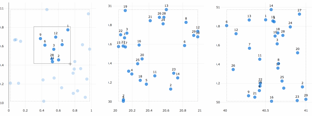
On every selection, the three graph callbacks are fired with the latest
selected regions of each plot. A pandas dataframe is filtered based on the selected points and the graphs are replotted with the selected points highlighted and the selected region drawn as a dashed rectangle.
As an aside, if you find yourself filtering and visualizing highly-dimensional datasets, you should consider checking out the parallel coordinates chart type.
There’s a lot that you can do with these interactive plotting features. If you need help exploring your use case, open up a thread in the Dash Community Forum.
The next chapter of the Dash Fundamentals explains how to share data between callbacks. Go to Dash Fundamentals Part 4: Sharing Data Between Callbacks.