Tooltip Component
Tooltip components allow you to add your own tooltips to the grid’s column headers and cells. Use these when the
provided tooltip component or
the default browser tooltip do not
meet your requirements.
Implementing a Tooltip Component
When a tooltip component is instantiated the full properties available as inputs are detailed
in AG Grid docs.
Moreover, the behavior of the tooltip can be modified through the Grid Options:
- tooltipShowDelay - Set the number of milliseconds before the tooltip shows.
- tooltipHideDelay - Set the number of milliseconds before the tooltip is hidden.
- tooltipMouseTrack - Makes the tooltips follow the cursor - don’t use when
tooltipInteraction = True. - tooltipInteraction - When
True, the tooltip does not hide on hover making possible to interact with the tooltip. See Interactive Custom Tooltips example. - popupParent - To allow the tooltip content to extend beyond the grid boundary, this parameter can be set to a function returning a DOM element to use as parent for the popups including the tooltips. See Interactive Custom Tooltips example.
Dynamic Tooltip
When working with Custom Cell Renderers it is possible to register custom tooltips that are displayed dynamically by
using the setTooltip method.
For more information and an example of a tooltip that displays on truncated cell values see
the Cell Rendering.
Simple Custom Tooltip
The example below demonstrates how to provide custom tooltips to the grid. In the example:
- The Custom Tooltip Component is defined in the
dashAgGridComponentFunctions.jsfile in theassetsfolder. - The Custom Tooltip Component is supplied by name via
tooltipComponent. - The Custom Tooltip Parameters (for tooltip background color) are supplied using
tooltipComponentParams. - Tooltips are displayed instantly by setting
tooltipShowDelayto 0. - Tooltips hide in 2000ms by setting
tooltipHideDelayto 2000. - Tooltips will be shown for the
athleteandcountrycolumns
View Custom Tooltip Renderer used for this example.
View Custom Tooltip Renderer used for this example.
This JavaScript function must be added to the dashAgGridComponentFunctions.js file in the assets folder.
See Custom Components for more
information.
var dagcomponentfuncs = (window.dashAgGridComponentFunctions = window.dashAgGridComponentFunctions || {});

dagcomponentfuncs.CustomTooltipSimple = function (props) {
    return React.createElement(
        'div',
        {
            style: {
                border: '5px double',
                backgroundColor: props.color || 'grey',
                padding: 10,
            },
        },
        [
            React.createElement('b', {}, props.data.athlete),
            React.createElement('div', {}, 'Country: ' + props.data.country),
            React.createElement('div', {}, 'Total: ' + props.data.total),
        ]
    );
};
```python
import dash_ag_grid as dag
from dash import Dash, html
import pandas as pd

app = Dash(__name__)

df = pd.read_csv(
    "https://raw.githubusercontent.com/plotly/datasets/master/ag-grid/olympic-winners.csv"
)

columnDefs = [
    {
        "field": "athlete",
        'minWidth': 150,
        'tooltipField': 'athlete',
        'tooltipComponentParams': {'color': '#55AA77'}
    },
    {"field": "age"},
    {"field": "country", 'minWidth': 130, 'tooltipField': 'country'},
    {"field": "year"},
    {"field": "date"},
    {"field": "sport"},
]

app.layout = html.Div(
    dag.AgGrid(
        id="custom-tooltip-simple-grid",
        columnDefs=columnDefs,
        rowData=df.to_dict("records"),
        columnSize="sizeToFit",
        defaultColDef={"tooltipComponent": "CustomTooltipSimple"},
        dashGridOptions={'tooltipShowDelay': 0, 'tooltipHideDelay': 2000}
    )
)

if __name__ == "__main__":
    app.run(debug=True)
```
Header Tooltip with Custom Tooltip
When we want to display a header tooltip, we set the headerTooltip config as a string, and that string will be
displayed as the tooltip. However, when working with custom tooltips we set the Column Definition tooltipComponent to
assign the column’s tooltip component and the headerTooltip value will passed to the params object.
If
headerTooltipis not present, the tooltip will not be rendered.
The example below shows how to set a custom tooltip to a header and to a grouped header. Note the following:
- The column Name does not have a
tooltipComponentso the default tooltip will be used with the value set with
theheaderTooltipparameter for the header and ‘tooltipField’ for the cells. - The columns Age and Country use
tooltipComponentso the value inheaderTooltipis passed to the
tooltipComponentparamsto be used. - The column group Athletes also uses
tooltipComponent. - The
tooltipComponentdetects that it’s being rendered by a header because theparamsobject does not contain
arowIndexvalue and if the header haschildrenit’s a grouped header.
View Custom Tooltip Renderer used for this example.
View Custom Tooltip Renderer used for this example.
This JavaScript function must be added to the dashAgGridComponentFunctions.js file in the assets folder.
See Custom Components for more
information.
var dagcomponentfuncs = (window.dashAgGridComponentFunctions = window.dashAgGridComponentFunctions || {});


dagcomponentfuncs.CustomTooltipHeaders = function (props) {
    const isCell = props.node.rowIndex !== undefined;
    const isGroupedHeader = !isCell && !!props.colDef.children;

    const children = [React.createElement('div', {}, props.value)];

    // if tooltip of the group header: append columns names list
    if (isGroupedHeader) {
        const headerNames = [];
        props.colDef.children.forEach(
            header => {
                headerNames.push(
                    header.headerName
                        ? header.headerName
                        : header.field.charAt(0).toUpperCase() + header.field.slice(1) //capitalize the field name
                )
            }
        )

        children.push(
            React.createElement('div', {}, `(${headerNames.join(" - ")})`)
        )
    }

    // if tooltip of the cells: add in first line the column headerTooltip text
    if (isCell) {
        children.unshift(
            React.createElement('b', {},
                props.colDef.headerTooltip
                    ? props.colDef.headerTooltip + ':'
                    : props.colDef.field.charAt(0).toUpperCase() + props.colDef.field.slice(1) + ':' //capitalize the field name
            )
        )
    }

    const eltProps = {style: {border: '5px double', backgroundColor: '#119dff', padding: 10},}

    return React.createElement('div', eltProps, children)
};
```python
import dash_ag_grid as dag
from dash import Dash, html
import pandas as pd

app = Dash(__name__)

df = pd.read_csv(
    "https://raw.githubusercontent.com/plotly/datasets/master/ag-grid/olympic-winners.csv"
)

columnDefs = [
    {
        'headerName': 'Athletes',
        'headerTooltip': 'Athletes Info',
        "tooltipComponent": "CustomTooltipHeaders",
        'children': [
            {
                'headerName': 'Name',
                "field": "athlete",
                'tooltipField': 'athlete',
                'headerTooltip': "Athlete's Name",
            },
            {
                "field": "age",
                'tooltipField': 'age',
                'headerTooltip': "Athlete's Age",
                "tooltipComponent": "CustomTooltipHeaders"
            },
            {
                "field": "country",
                'tooltipField': 'country',
                'headerTooltip': "Athlete's Country",
                "tooltipComponent": "CustomTooltipHeaders"
            },
        ]
    },
    {"field": "year"},
    {"field": "date"},
    {"field": "sport"},
    {"field": "total"},
]

app.layout = html.Div(
    dag.AgGrid(
        id="custom-tooltip-header-grid",
        columnDefs=columnDefs,
        rowData=df.to_dict("records"),
        columnSize="sizeToFit",
        dashGridOptions={'tooltipShowDelay': 0, 'tooltipHideDelay': 5000}
    )
)

if __name__ == "__main__":
    app.run(debug=True)
```
Interactive Custom Tooltips
The example below enables tooltip interaction with custom tooltips. Note following:
- Tooltips will not disappear while being hovered setting the Grid Option
'tooltipInteraction': True - The custom tooltip of the Country column displays a color picker that can be used to modify the color of the
background of the hovered cell. - The custom tooltip of the Country column also receives a custom
parameter{"gridId": "custom-tooltip-interactive-grid"}used by the tooltip to apply the output color to the current
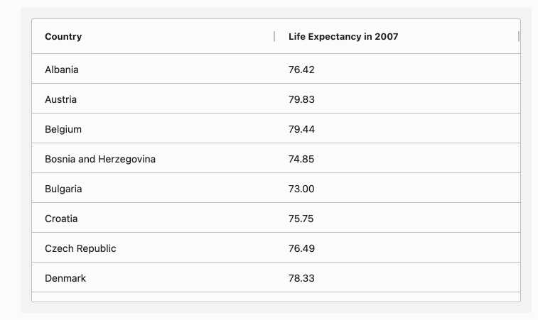
grid only. - The custom tooltip of the Life Expectancy in 2007 shows a Plotly graph with the historical data.
- A function returning the body DOM element is provided to the Grid Option
popupParentto allow the tooltips content,
in particular the graph tooltips in this example, to extend beyond the grid boundary.
It’s important to keep in mind that one figure is created per row. If data contains thousands of rows, it may be a
good idea to consider using Infinite Row Model and
creating the figures as the rows are loaded to improve performance.
View the JavaScript function used for this example.
View the JavaScript function used for this example.
This JavaScript function must be added to the dashAgGridFunctions.js file in the assets folder.
See JavaScript Functions
for more information.
var dagfuncs = (window.dashAgGridFunctions = window.dashAgGridFunctions || {});

dagfuncs.setPopupsParent = () => {
    return document.querySelector('body')
}
View Custom Tooltip Renderers used for this example.
View Custom Tooltip Renderers used for this example.
Those JavaScript functions must be added to the dashAgGridComponentFunctions.js file in the assets folder.
See Custom Components for more
information.
var dagcomponentfuncs = (window.dashAgGridComponentFunctions = window.dashAgGridComponentFunctions || {});

// Note: The app layout must be wrapped with dmc.MantineProvider for this component to work
dagcomponentfuncs.DMC_ColorPicker = function (props) {
    const selector = `#${props.gridId} [row-index="${props.node.rowIndex}"] [col-id="${props.column.colId}"]`
    const cell = document.querySelector(selector);

    function onChange(colorPickerValue) {
        cell.style.backgroundColor = colorPickerValue
    }

    return React.createElement(
        window.dash_mantine_components.ColorPicker,
        {onChange}
    );
};

dagcomponentfuncs.FigTooltip = function (props) {
    return React.createElement(
        window.dash_core_components.Graph,
        {
            figure: props.value,
            config: {displayModeBar: false}
        }
    )
};
import dash_ag_grid as dag
from dash import Dash, html
import dash_mantine_components as dmc

import plotly.express as px

app = Dash(__name__)

df = px.data.gapminder().query("continent=='Europe'")
df2 = df.groupby("country")["lifeExp"].last().reset_index()

df2["graph"] = ""
for i, row in df2.iterrows():
    filterDf = df[df["country"] == row["country"]]
    fig = px.line(filterDf, x="year", y="lifeExp", title=row["country"], width=400, height=200)
    fig.update_layout(
        margin=dict(l=40, r=40, t=40, b=40),
        paper_bgcolor="LightSteelBlue"
    )
    df2.at[i, "graph"] = fig

columnDefs = [
    {
        "field": "country",
        "tooltipField": "country",
        "tooltipComponent": "DMC_ColorPicker",
        "tooltipComponentParams": {"gridId": "custom-tooltip-interactive-grid"}
    },
    {
        "field": "lifeExp",
        "headerName": "Life Expectancy in 2007",
        "valueFormatter": {"function": 'd3.format("(,.2f")(params.value)'},
        "tooltipField": "graph",
        "tooltipComponent": "FigTooltip",
    },
]

# The app layout must be wrapped with dmc.MantineProvider for the DMC_ColorPicker component to work
app.layout = dmc.MantineProvider(
    html.Div(
        [
            dag.AgGrid(
                id="custom-tooltip-interactive-grid",
                rowData=df2.to_dict("records"),
                columnSize="sizeToFit",
                columnDefs=columnDefs,
                dashGridOptions={
                    'tooltipShowDelay': 0, 'tooltipHideDelay': 10000, 'tooltipInteraction': True,
                    "popupParent": {"function": "setPopupsParent()"}
                }
            ),
        ]
    )
)

if __name__ == "__main__":
    app.run(debug=True)