Styling Headers

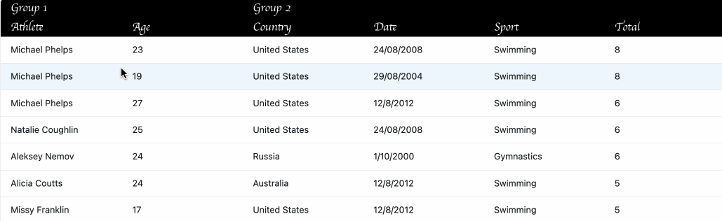
Style grid header cells and column groups.

The grid exposes many CSS variables starting --ag-header-* for customizing header appearance, and when these are not
enough you can use CSS classes, in particular ag-header, ag-header-cell, and <code>
ag‑header‑group‑cell<code>:

.ag-theme-alpine {
    --ag-header-height: 30px;
    --ag-header-foreground-color: white;
    --ag-header-background-color: black;
    --ag-header-cell-hover-background-color: rgb(80, 40, 140);
    --ag-header-cell-moving-background-color: rgb(80, 40, 140);
}

.ag-theme-alpine .ag-header {
    font-family: cursive;
}

.ag-theme-alpine .ag-header-group-cell {
    font-weight: normal;
    font-size: 22px;
}

.ag-theme-alpine .ag-header-cell {
    font-size: 18px;
}

The above code would apply to every grid with the ag-theme-alpine. In this example, we also add a .headers1 class so
that it will only apply to this example.

Header Column Separators and Resize Handles

Header Column Separators appear between every column, whereas Resize Handles only appear on resizeable columns (Group 1
in the example below).

ag-theme-alpine {
    --ag-header-column-separator-display: block;
    --ag-header-column-separator-height: 100%;
    --ag-header-column-separator-width: 2px;
    --ag-header-column-separator-color: purple;

    --ag-header-column-resize-handle-display: block;
    --ag-header-column-resize-handle-height: 25%;
    --ag-header-column-resize-handle-width: 5px;
    --ag-header-column-resize-handle-color: orange;
}

The above code would apply to every grid with the ag-theme-alpine. In this example, we also add a .headers2 class so
that it will only apply to this example.

Style Header on Filter

Each time a Column Filter is applied to a column, the CSS
class ag-header-cell-filtered is added to the header. This can be used for adding style to headers that are filtered.

The example below adds some styling to ag-header-cell-filtered, so when you filter a column you will notice the column
header change.

.ag-header-cell-filtered {
    background-color: #1b6d85 !important;
    color: #fff !important;
}

.ag-header-cell-filtered span {
    color: #fff !important;
}

The above code would apply to every grid with the ag-theme-alpine. In this example, we also add
a <code>.header‑style‑on‑filter<code> class so that it will only apply to this example.

Full List of Header Variables

CSS Variable Description
<p>--ag-header-foreground-color<p><p>CSS color - like ‘red’ or ‘#fff’<p> Color of text and icons in the header.
<p>--ag-header-background-color<p><p>CSS color - like ‘red’ or ‘#fff’<p> Background color for all headers, including the grid header, panels, etc.
<p>--ag-header-cell-hover-background-color<p><p>CSS color - like ‘red’ or ‘#fff’<p> <p>Rollover color for header cells. If you set this variable and have enabled column reordering by dragging, you may want to set --ag-header-cell-moving-background-color to ensure that the rollover color remains in place during dragging.<p>
<p><code>‑‑ag‑header‑cell‑moving‑background‑color<code><p><p>CSS color - like ‘red’ or ‘#fff’<p> Color applied to header cells when the column is being dragged to a new position.
<p>--ag-header-height<p><p>CSS length - like ‘0’, ‘4px’ or ‘50%’<p> Height of header rows.
<p>--ag-header-column-separator-display<p><p>CSS display value - ‘block’ to show or ‘none’ to hide<p> Whether to display the header column separator - a vertical line that displays between every header cell.
<p>--ag-header-column-separator-height<p><p>CSS length - like ‘0’, ‘4px’ or ‘50%’<p> Height of the header column separator. Percentage values are relative to the header height.
<p>--ag-header-column-separator-width<p><p>CSS length - like ‘0’, ‘4px’ or ‘50%’<p> Width of the header column separator.
<p>--ag-header-column-separator-color<p><p>CSS color - like ‘red’ or ‘#fff’<p> Colour of the header column separator.
<p>--ag-header-column-resize-handle-display<p><p>CSS display value - ‘block’ to show or ‘none’ to hide<p> Whether to show the header column resize handle - a vertical line that displays only between resizeable header columns, indicating where to drag in order to resize the column.
<p>--ag-header-column-resize-handle-height<p><p>CSS length - like ‘0’, ‘4px’ or ‘50%’<p> Height of the header resize handle. Percentage values are relative to the header height.
<p>--ag-header-column-resize-handle-width<p><p>CCSS length - like ‘0’, ‘4px’ or ‘50%’<p> Width of the header resize handle.
<p>--ag-header-column-resize-handle-color<p><p>CSS color - like ‘red’ or ‘#fff’<p> Colour of the header resize handle.