Cell Editors
A cell editor component is the UI that appears, normally inside a cell, that takes care of the edit operation.
You can select from the Column Definitions or
create your own Column Definitions.
Cell Editor Components are configured using the cellEditor property of
the
```python
import dash_ag_grid as dag
from dash import Dash, html

app = Dash()

columnDefs = [
    {
        "headerName": "Make",
        "field": "make",
        "cellEditorPopup": True,
        "cellEditorPopupPosition": "under",
    },
    {
        "headerName": "Model",
        "field": "model",
        "cellEditorPopup": True,
        "cellEditorPopupPosition": "over",
    },
    {"headerName": "Price", "field": "price"},
]

rowData = [
    {"make": "Toyota", "model": "Celica", "price": 35000},
    {"make": "Ford", "model": "Mondeo", "price": 32000},
    {"make": "Porsche", "model": "Boxster", "price": 72000},
]

app.layout = html.Div(
    [
        dag.AgGrid(
            id="cell-editors-simple",
            columnDefs=columnDefs,
            rowData=rowData,
            columnSize="sizeToFit",
            defaultColDef={"editable": True},
            dashGridOptions={"animateRows": False}
        ),
    ],
)

if __name__ == "__main__":
    app.run(debug=True)
```
Dynamic Parameters
Parameters for cell editors can be dynamic to allow different selections based on what cell is being edited. For
example, you might have a ‘City’ column that has values based on the ‘Country’ column. To do this, provide a function
that returns parameters for the property cellEditorParams.
View the JavaScript function used for this example.
View the JavaScript function used for this example.
This JavaScript function must be added to the dashAgGridFunctions.js file in the assets folder.
See JavaScript Functions
for more information.
var dagfuncs = (window.dashAgGridFunctions = window.dashAgGridFunctions || {});

dagfuncs.dynamicOptions = function (params) {
    const selectedCountry = params.data.country;
    if (selectedCountry === "United States") {
        return {
            values: ["Boston", "Chicago", "San Francisco"],
        };
    } else {
        return {
            values: ["Montreal", "Vancouver", "Calgary"],
        };
    }
};
```python
import dash_ag_grid as dag
from dash import Dash, html

app = Dash()

columnDefs = [
    {"field": "country"},
    {
        "headerName": "Select Editor",
        "field": "city",
        "editable": True,
        "cellEditor": "agSelectCellEditor",
        "cellEditorParams": {"function": "dynamicOptions(params)"},
    },

]

rowData = [
    {"country": "United States", "city": "Boston"},
    {"country": "Canada", "city": "Montreal"},
    {"country": "Canada", "city": "Vancouver"},
]

app.layout = html.Div(
    [
        dag.AgGrid(
            id="cell-editors-dynamic",
            columnDefs=columnDefs,
            rowData=rowData,
            columnSize="sizeToFit",
            dashGridOptions={"animateRows": False}
        ),
    ]
)

if __name__ == "__main__":
    app.run(debug=True)
```
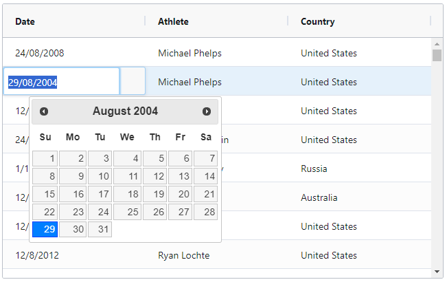
Custom Datepicker Cell Editing
The example below demonstrates how to use a custom date picker as a cell editor. The ‘Date’ column uses a component
cell editor that allows you to pick a date using jQuery UI Datepicker.
- the jQuery is included as external scripts and stylesheets in the app constructor.
- The Custom
DatePickeris supplied by name viacellEditor. - You can change the format of the date returned from the
DatePickerin thedatepickerfunction.
View the JavaScript class used for this example.
View the JavaScript class used for this example.
This JavaScript class must be added to the dashAgGridFunctions.js file in the assets folder.
See JavaScript Functions
for more information.
var dagfuncs = (window.dashAgGridFunctions = window.dashAgGridFunctions || {});

dagfuncs.DatePicker = class {
    // gets called once before the renderer is used
    init(params) {
        // create the cell
        this.eInput = document.createElement("input");
        this.eInput.value = params.value;
        this.eInput.classList.add("ag-input");
        this.eInput.style.height = "var(--ag-row-height)";
        this.eInput.style.fontSize = "calc(var(--ag-font-size) + 1px)";

        // <a href="https://jqueryui.com/datepicker/">https://jqueryui.com/datepicker/</a>
        $(this.eInput).datepicker({
            dateFormat: "dd/mm/yy",
            onSelect: () => {
                this.eInput.focus();
            },
        });
    }

    // gets called once when grid ready to insert the element
    getGui() {
        return this.eInput;
    }

    // focus and select can be done after the gui is attached
    afterGuiAttached() {
        this.eInput.focus();
        this.eInput.select();
    }

    // any cleanup we need to be done here
    destroy() {
        // but this example is simple, no cleanup, we could
        // even leave this method out as it's optional
    }

    // if true, then this editor will appear in a popup
    isPopup() {
        // and we could leave this method out also, false is the default
        return false;
    }
};
```python

import dash_ag_grid as dag
from dash import Dash, html
import pandas as pd

app = Dash(
    __name__,
    external_scripts=[
        "https://cdnjs.cloudflare.com/ajax/libs/jquery/1.12.1/jquery.min.js",
        "https://cdnjs.cloudflare.com/ajax/libs/jqueryui/1.12.1/jquery-ui.min.js",
    ],
    external_stylesheets=[
        "https://cdnjs.cloudflare.com/ajax/libs/jqueryui/1.12.1/jquery-ui.min.css"
    ],
)

df = pd.read_csv(
    "https://raw.githubusercontent.com/plotly/datasets/master/ag-grid/olympic-winners.csv"
)

columnDefs = [
    {"field": "date", "cellEditor": {"function": "DatePicker"}},
    {"field": "athlete"},
    {"field": "country"},
]

app.layout = html.Div(
    [
        dag.AgGrid(
            id="cell-editors-custom-datepicker",
            columnDefs=columnDefs,
            rowData=df.to_dict("records"),
            defaultColDef={"flex": 1, "editable": True},
        ),
    ]
)

if __name__ == "__main__":
    app.run(debug=True)
```