 HoloViews Overview
HoloViews is an ambitious project that aims to provide a flexible grammar of
visualization types and plot interactions. HoloViews specifications can be
displayed using a variety of technologies, including Plotly.js and Dash.
While HoloViews can be used to create a large variety of visualizations, for Dash
users it is particularly helpful for two use cases: Automatically linking selections
across multiple figures and displaying large data sets using Datashader.
HoloViews also provides a uniform interface to a variety of data structures,
making it easy to start out by visualizing small pandas DataFrames and then scale
up to GPU accelerated RAPIDS cudf DataFrames, or larger than memory Dask DataFrames.
For more background information, see the main HoloViews documentation at
https://holoviews.org/
HoloViews Elements and Containers
The visualization primitives in HoloViews are called elements. Elements
in HoloViews are analogous to Plotly traces, and there are specific elements for
Scatter,
Area,
Bars,
Histogram,
Heatmap,
etc.
Elements can be grouped together into various containers including the
Overlay
container for overlaying multiple compatible elements on the same axes, and the
Layout
container for displaying multiple elements side by side as separate subplots.
Additionally, HoloViews supports several more advanced “Dimensioned” containers
to aid in the visualization of multi-dimensional datasets including the
HoloMap,
Gridspace,
NdLayout,
and
Ndoverlay
containers.
Finally, the
DynamicMap
is a special container than produces elements dynamically, often
in response to user interaction events. This documentation page does not discuss
the creation of general DynamicMap instances, but it’s helpful to understand
that the datashade and link_selections transformations discussed below both
produce either DynamicMap instances, or containers of DynamicMap instances.
HoloViews Datasets
While it’s possible to build HoloViews elements directly from external data
structures like numpy arrays and pandas DataFrames, HoloViews also provides a
Dataset class that aims to serve as a universal interface to these data
structures. The recommended workflow is to first wrap the original data structure
(e.g. the pandas DataFrame) in a Dataset instance, and then construct
elements using this Dataset.
This workflow has two main advantages:
-
It makes it easy to swap out data structures in the future. For example, you
could develop a visualization using a small pandas DataFrame and then later
switch to a GPU accelerated cuDF DataFrame or a larger-than-memory dask
DataFrame. -
It allows HoloViews to associate each visualization element with all of the
dimensions (i.e. columns in the case of a DataFrame) in the originalDataset.
This is what makes it possible for HoloViews to automate the process of
linking selections across visualizations that do not all display the same
dimensions. See the following sections for some examples of using the
link_selectionsfunction to accomplish this.
The examples in this documentation page use Dataset instances that wrap tabular
data structures. But Datasets also support wrapping gridded datasets like numpy
ndarray
and xarray
DataArray
objects. See the
Tabular Datasets
documentation page for more information on wrapping tabular data structures, and
see the
Gridded Datasets
documentation page for more information on wrapping gridded data structures.
Building Dash Components from HoloViews Objects
HoloViews elements and containers can be converted into Dash components using the
holoviews.plotting.plotly.dash.to_dash function. This function inputs
a dash.Dash app instance and a list of HoloViews objects, and returns a
namedtuple with the following properties.
graphs: This is a list of convertedGraphcomponents with the same
length as the input list of HoloViews objects. By default, these will have
typedash_core_components.Graph, but an alternative graph component class
(e.g.dash_design_kit.Graph) can be specified using thegraph_class
argument to theto_dashfunction.resets: If thereset_button=Trueargument is passed to
to_dash, theresetsproperty will hold a length 1 list
containing a Dash component that represents a reset button. When clicked,
this button will reset the graphs to their initial state. This will reset
both the figure viewports and other interactive states like the active
selection produced by thelink_selectionexamples below. If
reset_button=False, the default, then this list will be empty.store: A DashStorecomponent that is used
internally to maintain the joint interactive state of all of the converted
Dash components.kdims: For Dimensioned HoloViews containers, thekdims
property holds a dictionary from key-dimension names to Dash components
that represent sliders for each key dimension. Dimensioned Containers are
not discussed further here; see the
Dimensioned Containers
section in the HoloViews documentation for more information.children: This is a list that contains all of the components above. This can
be assigned directly to thechildrenproperty of anhtml.Divcomponent if
no additional layout structure is needed.
After calling to_dash, each of the resulting components must be
included somewhere in the app’s layout. This can be done by either:
- including the
childrenlist as thechildrenproperty of anhtml.Div
component. - including all of the components stored in
graphs,resets,kdims, and
storesomewhere in the app’s layout.
Display Simple HoloViews Elements with Dash
This example loads the iris dataset included in plotly.py and wraps it in a
HoloViews Dataset. This Dataset is then used to construct a
Scatter
element and a
Histogram
element. The Histogram element is created using the
histogram
operation which is what executes the histogram binning algorithm.
These two elements are converted into two Dash Graph components using the
to_dash function, and are placed into a Div component along with the
associated Store component.
from dash import Dash, html
from plotly.data import iris

import holoviews as hv
from holoviews.plotting.plotly.dash import to_dash

# Load dataset
df = iris()
dataset = hv.Dataset(df)

scatter = hv.Scatter(dataset, kdims=["sepal_length"], vdims=["sepal_width"])
hist = hv.operation.histogram(
    dataset, dimension="petal_width", normed=False
)

app = Dash()
components = to_dash(app, [scatter, hist])

app.layout = html.Div(components.children)

if __name__ == "__main__":
    app.run(debug=True)
Styling Figures Produced by HoloViews
There are two general approaches that can be used to customize the appearance
of the Plotly figures produced by HoloViews.
Options System
The first is the HoloViews options system. This approach uses the syntax:
element.opts(option1=value1, option2=value2)
This is very analogous to the fig.update() syntax that is used to update Plotly
plotly.graph_object.Figure objects. The available options for a particular
element type can be discovered from a Python or IPython REPL using the
holoviews.help function. For example:
import holoviews as hv
hv.extension("plotly")
hv.help(hv.Scatter)
A slightly different syntax is used to style elements inside a container. Here is
an example of how Scatter element options would be applied to a container that
contains or produces Scatter elements:
from holoviews import opts
container.opts(opts.Scatter(option1=value1, option2=value2))
This makes it possible to target options to elements of specific types within
a container. This is the approach that must be used to apply options to the
DynamicMap instances produced by the datashade and link_selections
transformations discussed below.
The example below customizes the appearance of a Scatter element using the
size and color options.
See the
Applying Customizations
section of the HoloViews documentation for more information on styling figures
using the options system.
Plot Hooks
HoloViews aims to expose the most common plot options through the opts syntax
above, but the coverage of possible plotly configuration options is not exhaustive.
HoloViews provides a system called “plot hooks” to make it possible to apply arbitrary
figure customizations. Every element has a special option named hooks that may
be set to a list of functions that should be applied to the figure that HoloViews
generates before it is displayed.
The example below uses a plot hook to change the default drag tool from
zoom to pan.
See the
Plot hooks
section in the HoloViews documentation for more information.
from dash import Dash, html
from plotly.data import iris

import holoviews as hv
from holoviews.plotting.plotly.dash import to_dash

# Load dataset
df = iris()
dataset = hv.Dataset(df)

scatter = hv.Scatter(dataset, kdims=["sepal_length"], vdims=["sepal_width"])

# Set scatter size and color using options system
scatter.opts(size=15, color="purple")

# Set default drag mode to pan using a plot hook
def hook(plot, element):
    fig = plot.state
    fig["layout"]["dragmode"] = "pan"
scatter.opts(hooks=[hook])

app = Dash()
components = to_dash(app, [scatter])

app.layout = html.Div(components.children)

if __name__ == "__main__":
    app.run(debug=True)
Linked Selections with HoloViews
One HoloViews feature that is particularly convenient for Dash users is the ability
to automatically link selections across figures without the need to manually define
any callback functions.
This can be done by first creating a link_selections instance
(called selection_linker in the examples below) using the
link_selections.instance() method, and then calling this object as a function
with the elements or containers to be linked.
When these linked elements are passed to the to_dash function, Dash
callbacks to achieve this interactive linking behavior are automatically generated
and registered with the provided dash.Dash app instance.
This example shows how the reset_button=True argument to to_dash can
be used to create a Dash button component. When this button is clicked, the plot
viewport and selection states are reset to their original values.
For more background on linked selections in HoloViews, see the
Linked Brushing
documentation section.
Try using the box-selection tool to select regions of space in each figure and
notice how the selection of the corresponding data is displayed in both figures.
Note that only box selection is supported right now. Lasso selection support
is not yet implemented.
from dash import Dash, html
from plotly.data import iris

import holoviews as hv
from holoviews import opts
from holoviews.plotting.plotly.dash import to_dash

# Load dataset
df = iris()
dataset = hv.Dataset(df)

# Build selection linking object
selection_linker = hv.selection.link_selections.instance()
scatter = selection_linker(
    hv.Scatter(dataset, kdims=["sepal_length"], vdims=["sepal_width"])
)
hist = selection_linker(
    hv.operation.histogram(dataset, dimension="petal_width", normed=False)
)

# Use plot hook to set the default drag mode to box selection
def set_dragmode(plot, element):
    fig = plot.state
    fig['layout']['dragmode'] = "select"
    if isinstance(element, hv.Histogram):
        # Constrain histogram selection direction to horizontal
        fig['layout']['selectdirection'] = "h"

scatter.opts(opts.Scatter(hooks=[set_dragmode]))
hist.opts(opts.Histogram(hooks=[set_dragmode]))

app = Dash()
components = to_dash(
    app, [scatter, hist], reset_button=True
)
app.layout = html.Div(components.children)

if __name__ == "__main__":
    app.run(debug=True)
Visualizing Large Datasets with Datashader
Another HoloViews feature that is particularly convenient for Dash users is the
integration with Datashader.
Datashader is a Python library for quickly creating a variety of principled
visualizations of large datasets.
While the Plotly scattergl trace can handle hundreds of thousands of points,
Datashader can handle tens to hundreds of millions. The difference is that rather
than passing the entire dataset from the Python server to the browser for rendering,
Datashader rasterizes the dataset to a heatmap or image, and only this heatmap or
image is transferred to the browser for rendering.
To effectively use Datashader in an interactive context, it’s necessary to rerender
the dataset each time the figure viewport changes. This can be accomplished in
Dash by installing a callback function that listens for changes to the
relayoutData prop. Because of how HoloViews packages data lazily (without
rendering it immediately), replaying this pipeline of transformations can be
accomplished without manually defining any callbacks, making Datashader much easier
to use than if invoked without HoloViews.
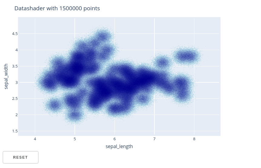
This example loads the iris dataset included in plotly.py and then duplicates
it many times with added noise to generate a DataFrame with 1.5 million rows.
This large pandas DataFrame is wrapped in a HoloViews Dataset and then used to
construct a Scatter element.
The datashade operation is used to transform the Scatter element into
a datashaded scatter element that automatically updates in response to zoom / pan
events. The to_dash function is then used to build a single Dash
Graph component and a reset button.
When zooming and panning on this figure, notice how the datashaded image is
automatically updated. The reset button can be used to reset to the initial figure
viewport.
For more information on using datashader through HoloViews, see the
Large Data section of the
HoloViews documentation.
from dash import Dash, html
from plotly.data import iris

import holoviews as hv
from holoviews.plotting.plotly.dash import to_dash
from holoviews.operation.datashader import datashade

import numpy as np
import pandas as pd

# Load iris dataset and replicate with noise to create large dataset
df_original = iris()[["sepal_length", "sepal_width", "petal_length", "petal_width"]]
df = pd.concat([
df_original + np.random.randn(*df_original.shape) * 0.1
for i in range(10000)
])
dataset = hv.Dataset(df)

scatter = datashade(
hv.Scatter(dataset, kdims=["sepal_length"], vdims=["sepal_width"])
).opts(title="Datashader with %d points" % len(dataset))

app = Dash()
components = to_dash(
app, [scatter], reset_button=True
)

app.layout = html.Div(components.children)

if __name__ == "__main__":
    app.run(debug=True)
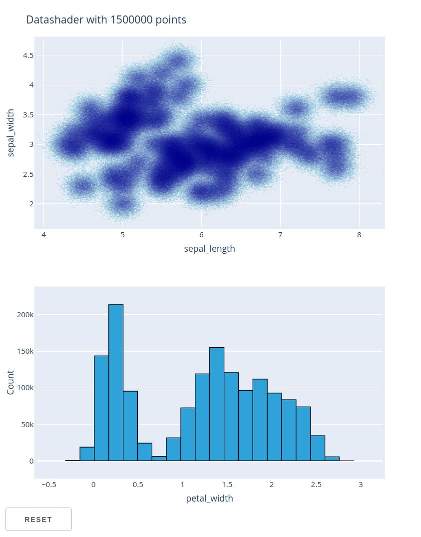
Combining Datashader and Linked Selections
This examples shows how the two previous examples can be combined to support
linking selections across a histogram and a datashaded scatter plot of 1.5 million
points.
When using the box-selection tool to select regions of space in each figure,
notice how the selection of the corresponding data is displayed in both figures.
Also, when zooming and panning on datashaded scatter figure, notice how the
datashaded image is automatically updated. The reset button can be used to reset
to the initial figure viewport and clear the current selection.
from dash import Dash, html
from plotly.data import iris

import holoviews as hv
from holoviews import opts
from holoviews.plotting.plotly.dash import to_dash
from holoviews.operation.datashader import datashade

import numpy as np
import pandas as pd

# Load iris dataset and replicate with noise to create large dataset
df_original = iris()[["sepal_length", "sepal_width", "petal_length", "petal_width"]]
df = pd.concat([
df_original + np.random.randn(*df_original.shape) * 0.1
for i in range(10000)
])
dataset = hv.Dataset(df)

# Build selection linking object
selection_linker = hv.selection.link_selections.instance()

scatter = selection_linker(
hv.operation.datashader.datashade(
    hv.Scatter(dataset, kdims=["sepal_length"], vdims=["sepal_width"])
)
).opts(title="Datashader with %d points" % len(dataset))

hist = selection_linker(
hv.operation.histogram(dataset, dimension="petal_width", normed=False)
)

# Use plot hook to set the default drag mode to vertical box selection
def set_hist_dragmode(plot, element):
    fig = plot.state
    fig['layout']['dragmode'] = "select"
    fig['layout']['selectdirection'] = "h"

hist.opts(opts.Histogram(hooks=[set_hist_dragmode]))

app = Dash()
components = to_dash(
app, [scatter, hist], reset_button=True
)

app.layout = html.Div(components.children)

if __name__ == "__main__":
    app.run(debug=True)
Map Overlay
Most 2-dimensional HoloViews elements can be displayed on top of a map by
overlaying them on top of a Tiles element. There are three approaches to
configuring the map that is displayed by a Tiles element:
- Construct a
holoviews.Tileselement with a templated WMTS tile server url.
E.g.Tiles("https://maps.wikimedia.org/osm-intl/{Z}/{X}/{Y}@2x.png") - Construct a
Tileselement with a predefined tile server url using a
function from theholoviews.element.tiles.tile_sourcesmodule. E.g.CartoDark() - Construct a
holoviews.Tileselement no constructor argument, then use.opts
to supply a mapbox token and style.
E.g.Tiles().opts(mapboxstyle="light", accesstoken="pk...")
Coordinate Systems: Unlike the native plotly mapbox traces which accept
geographic positions in longitude and latitude coordinates, HoloViews expects
geographic positions to be supplied in Web Mercator coordinates
(https://epsg.io/3857). Rather than “longitude” and “latitude”, horizontal and
vertical coordinates in Web Mercator are commonly called “easting” and “northing”
respectively. HoloViews providesTiles.lon_lat_to_easting_northingand
Tiles.easting_northing_to_lon_latfor converting between coordinate systems.
This example displays a scatter plot of the plotly.data.carshare dataset on top
of the predefined StamenTerrain WMTS map.
from dash import Dash, html
import holoviews as hv
from holoviews.plotting.plotly.dash import to_dash
from holoviews.element.tiles import CartoDark
from plotly.data import carshare

# Convert from lon/lat to web-mercator easting/northing coordinates
df = carshare()
df["easting"], df["northing"] = hv.Tiles.lon_lat_to_easting_northing(
    df["centroid_lon"], df["centroid_lat"]
)

points = hv.Points(df, ["easting", "northing"]).opts(color="crimson")
tiles = CartoDark()
overlay = tiles * points

app = Dash()
components = to_dash(app, [overlay])

app.layout = html.Div(
    components.children
)

if __name__ == '__main__':
    app.run(debug=True)
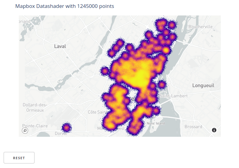
Visualizing a Large Geographic Dataset with Datashader
This example demonstrates how to use datashader to display a large geographic
scatter plot on top of a vector tiled Mapbox map. A large dataset is synthesized
by repeating the carshare dataset and adding Gaussian noise to the positional
coordinates.
Using mapbox maps requires a free mapbox account and an associated access token.
This example assumes the mapbox access token is stored in a local file named
.mapbox_token. To run this example yourself, either create a file with this name
in your working directory that contains your token, or assign themapbox_token
variable to a string containing your token.
from dash import Dash, html
import holoviews as hv
from holoviews.plotting.plotly.dash import to_dash
from holoviews.operation.datashader import datashade
import pandas as pd
import numpy as np
from plotly.data import carshare
from plotly.colors import sequential

# Mapbox token (replace with your own token string)
mapbox_token = open(".mapbox_token").read()

# Convert from lon/lat to web-mercator easting/northing coordinates
df_original = carshare()
df_original["easting"], df_original["northing"] = hv.Tiles.lon_lat_to_easting_northing(
df_original["centroid_lon"], df_original["centroid_lat"]
)

# Duplicate carshare dataframe with Gaussian noise to produce a larger dataframe
df = pd.concat([df_original] * 5000)
df["easting"] = df["easting"] + np.random.randn(len(df)) * 400
df["northing"] = df["northing"] + np.random.randn(len(df)) * 400

# Build Dataset and graphical elements
dataset = hv.Dataset(df)
points = hv.Points(
df, ["easting", "northing"]
).opts(color="crimson")
tiles = hv.Tiles().opts(mapboxstyle="light", accesstoken=mapbox_token)
overlay = tiles * datashade(points, cmap=sequential.Plasma)
overlay.opts(
title="Mapbox Datashader with %d points" % len(df),
width=800,
height=500
)

# Build App
app = Dash()
components = to_dash(app, [overlay], reset_button=True)

app.layout = html.Div(
components.children
)

if __name__ == '__main__':
    app.run(debug=True)
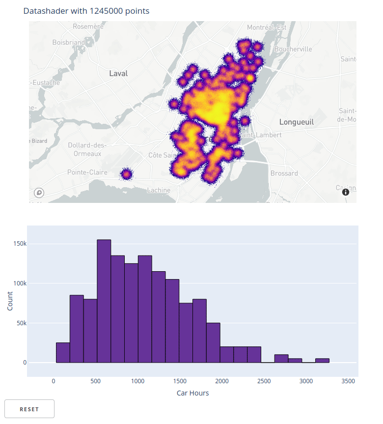
Mapbox datashader and linked selections
This example demonstrates how the link_selections transformation described above
can be used with geographic scatter plots. Here, the scatter plot is also
datashaded, but link_selections will work with plain Scatter elements
as well.
from dash import Dash, html
import holoviews as hv
from holoviews.plotting.plotly.dash import to_dash
from holoviews.operation.datashader import datashade
import pandas as pd
import numpy as np
from plotly.data import carshare
from plotly.colors import sequential

# Mapbox token (replace with your own token string)
mapbox_token = open(".mapbox_token").read()

# Convert from lon/lat to web-mercator easting/northing coordinates
df_original = carshare()
df_original["easting"], df_original["northing"] = hv.Tiles.lon_lat_to_easting_northing(
    df_original["centroid_lon"], df_original["centroid_lat"]
)

# Duplicate carshare dataframe with noise to produce a larger dataframe
df = pd.concat([df_original] * 5000)
df["easting"] = df["easting"] + np.random.randn(len(df)) * 400
df["northing"] = df["northing"] + np.random.randn(len(df)) * 400

# Build HoloViews Dataset and visual elements
dataset = hv.Dataset(df).redim.label(car_hours="Car Hours")
points = hv.Points(
    df, ["easting", "northing"]
).opts(color="crimson")
tiles = hv.Tiles().opts(mapboxstyle="light", accesstoken=mapbox_token)
overlay = tiles * datashade(points, cmap=sequential.Plasma).opts(width=800)

# Build histogram of car_hours column
hist = hv.operation.histogram(dataset, dimension="car_hours", normed=False)

# Use plot hook to set the default drag mode to horizontal box selection
def set_hist_dragmode(plot, element):
    fig = plot.state
    fig['layout']['dragmode'] = "select"
    fig['layout']['selectdirection'] = "h"

hist.opts(hooks=[set_hist_dragmode], color="rebeccapurple", margins=(50, 50, 50, 30))

# Link selections across datashaded points and histogram
selection_linker = hv.selection.link_selections.instance()
linked_points = selection_linker(
    tiles * datashade(points, cmap=sequential.Plasma)
).opts(title="Datashader with %d points" % len(dataset), margins=(50, 0, 50, 30))
linked_hist = selection_linker(hist)

# Build app
app = Dash()
components = to_dash(app, [linked_points, linked_hist], reset_button=True)

app.layout = html.Div(
    components.children
)

if __name__ == '__main__':
    app.run(debug=True)
GPU Accelerating Datashader and Linked Selections with RAPIDS
Many HoloViews operations, including datashade and link_selections, can be
accelerated on modern NVIDIA GPUs using technologies from the
RAPIDS
ecosystem. All of the previous examples can be GPU accelerated simply by
replacing the pandas DataFrame passed to the Dataset constructor with a
cuDF DataFrame.
![]()
The cudf.from_pandas function can be used to construct a cuDF DataFrame from a
pandas DataFrame. So adding GPU acceleration to each of the prior examples can be
done simply by replacing the dataset = hv.Dataset(df) statements with:
import cudf
dataset = hv.Dataset(cudf.from_pandas(df))
Advanced HoloViews
While motivated by Datashader and linked selections use cases, the
to_dash transformation supports arbitrary HoloViews objects and has
full support for the elements and stream types supported by the HoloViews Plotly
backend.
To demonstrate this, here are Dash ports of some of the interactive Plotly examples
from the HoloViews documentation.
Bounds & selection stream example
Based on
https://holoviews.org/reference/streams/plotly/Bounds.html#streams-plotly-gallery-bounds
A linked streams example demonstrating how to use Bounds and Selection
streams together.
from dash import Dash, html

import numpy as np
import holoviews as hv
from holoviews import streams
from holoviews.plotting.plotly.dash import to_dash

# Declare distribution of Points
points = hv.Points(
    np.random.multivariate_normal((0, 0), [[1, 0.1], [0.1, 1]], (1000,))
)

# Declare points selection
sel = streams.Selection1D(source=points)

# Declare DynamicMap computing mean y-value of selection
mean_sel = hv.DynamicMap(
    lambda index: hv.HLine(points['y'][index].mean() if index else -10),
    kdims=[], streams=[sel]
)

# Declare a Bounds stream and DynamicMap to get box_select geometry and draw it
box = streams.BoundsXY(source=points, bounds=(0,0,0,0))
bounds = hv.DynamicMap(lambda bounds: hv.Bounds(bounds), streams=[box])

# Declare DynamicMap to apply bounds selection
dmap = hv.DynamicMap(lambda bounds: points.select(x=(bounds[0], bounds[2]),
                                                  y=(bounds[1], bounds[3])),
                     streams=[box])

# Compute histograms of selection along x-axis and y-axis
yhist = hv.operation.histogram(
    dmap, bin_range=points.range('y'), dimension='y', dynamic=True, normed=False
)
xhist = hv.operation.histogram(
    dmap, bin_range=points.range('x'), dimension='x', dynamic=True, normed=False
)

# Combine components and display
layout = points * mean_sel * bounds << yhist << xhist

# Create App
app = Dash()
components = to_dash(
    app, [layout], reset_button=True, use_ranges=False,
)

app.layout = html.Div(components.children)

if __name__ == "__main__":
    app.run(debug=True)
BoundsX stream example
Based on
https://holoviews.org/reference/streams/plotly/BoundsX.html#streams-plotly-gallery-boundsx
A linked streams example demonstrating how to use BoundsX streams.
from dash import Dash, html

import pandas as pd
import numpy as np
import holoviews as hv
from holoviews import streams
from holoviews.plotting.plotly.dash import to_dash

n = 200
xs = np.linspace(0, 1, n)
ys = np.cumsum(np.random.randn(n))
df = pd.DataFrame({'x': xs, 'y': ys})
curve = hv.Scatter(df)


def make_from_boundsx(boundsx):
    sub = df.set_index('x').loc[boundsx[0]:boundsx[1]]
    return hv.Table(sub.describe().reset_index().values, 'stat', 'value')


dmap = hv.DynamicMap(
    make_from_boundsx, streams=[streams.BoundsX(source=curve, boundsx=(0, 0))]
)

layout = curve + dmap

# Create App
app = Dash()

# Dash display
components = to_dash(
    app, [layout], reset_button=True
)

app.layout = html.Div(components.children)

if __name__ == '__main__':
    app.run(debug=True)
BoundsY stream example
Based on
https://holoviews.org/reference/streams/plotly/BoundsY.html#streams-plotly-gallery-boundsy
A linked streams example demonstrating how to use BoundsY streams.
from dash import Dash, html

import numpy as np
import holoviews as hv
from holoviews import streams
from holoviews.plotting.plotly.dash import to_dash

xs = np.linspace(0, 1, 200)
ys = xs * (1 - xs)
curve = hv.Curve((xs, ys))
scatter = hv.Scatter((xs, ys)).opts(size=1)

bounds_stream = streams.BoundsY(source=curve, boundsy=(0, 0))

def make_area(boundsy):
    return hv.Area(
        (xs, np.minimum(ys, boundsy[0]), np.minimum(ys, boundsy[1])),
        vdims=['min', 'max']
    )

def make_items(boundsy):
    times = [
        "{0:.2f}".format(x)
        for x in sorted(np.roots([-1, 1, -boundsy[0]])) +
                 sorted(np.roots([-1, 1, -boundsy[1]]))
    ]
    return hv.ItemTable(
        sorted(zip(['1_entry', '2_exit', '1_exit', '2_entry'], times))
    )

area_dmap = hv.DynamicMap(make_area, streams=[bounds_stream])
table_dmap = hv.DynamicMap(make_items, streams=[bounds_stream])

layout = (curve * scatter * area_dmap + table_dmap)

# Create App
app = Dash()

# Dash display
components = to_dash(app, [layout], reset_button=True)

app.layout = html.Div(components.children)

if __name__ == '__main__':
    app.run(debug=True)
RangeXY stream example
Based on
https://holoviews.org/reference/streams/plotly/RangeXY.html#streams-plotly-gallery-rangexy
A linked streams example demonstrating how to use multiple Selection1D
streams on separate Points objects.
from dash import Dash, html

import numpy as np
import holoviews as hv
from holoviews.plotting.plotly.dash import to_dash

# Define an image
Y, X = (np.mgrid[0:100, 0:100]-50.)/20.
img = hv.Image(np.sin(X**2+Y**2))

def selected_hist(x_range, y_range):
    # Apply current ranges
    obj = img.select(x=x_range, y=y_range) if x_range and y_range else img

    # Compute histogram
    return hv.operation.histogram(obj)

# Define a RangeXY stream linked to the image
rangexy = hv.streams.RangeXY(source=img)

# Adjoin the dynamic histogram computed based on the current ranges
layout = img << hv.DynamicMap(selected_hist, streams=[rangexy])

# Create App
app = Dash()

# Dash display
components = to_dash(
    app, [layout], reset_button=True, use_ranges=False
)

app.layout = html.Div(components.children)

if __name__ == '__main__':
    app.run(debug=True)
Multiple selection streams example
A linked streams example demonstrating how to use multiple Selection1D streams
on separate Points objects.
from dash import Dash, html

import numpy as np
import holoviews as hv
from holoviews import opts, streams
from holoviews.plotting.plotly.dash import to_dash

# Declare two sets of points generated from multivariate distribution
points = hv.Points(
    np.random.multivariate_normal((0, 0), [[1, 0.1], [0.1, 1]], (1000,))
)
points2 = hv.Points(
    np.random.multivariate_normal((3, 3), [[1, 0.1], [0.1, 1]], (1000,))
)

# Declare two selection streams and set points and points2 as the source of each
sel1 = streams.Selection1D(source=points)
sel2 = streams.Selection1D(source=points2)

# Declare DynamicMaps to show mean y-value of selection as HLine
hline1 = hv.DynamicMap(
    lambda index: hv.HLine(points['y'][index].mean() if index else -10),
    streams=[sel1]
)
hline2 = hv.DynamicMap(
    lambda index: hv.HLine(points2['y'][index].mean() if index else -10),
    streams=[sel2]
)

# Combine points and dynamic HLines
layout = (points * points2 * hline1 * hline2).opts(
    opts.Points(height=400, width=400))

# Create App
app = Dash()

# Dash display
components = to_dash(
    app, [layout], reset_button=True
)

app.layout = html.Div(components.children)

if __name__ == '__main__':
    app.run(debug=True)
Point Selection1D stream example
A linked streams example demonstrating how to use Selection1D to get
currently selected points and dynamically compute statistics of selection.
from dash import Dash, html

import numpy as np
import holoviews as hv
from holoviews import streams
from holoviews.plotting.plotly.dash import to_dash

# Declare some points
points = hv.Points(np.random.randn(1000, 2))

# Declare points as source of selection stream
selection = streams.Selection1D(source=points)

# Write function that uses the selection indices to slice points and compute stats
def selected_info(index):
    selected = points.iloc[index]
    if index:
        label = 'Mean x, y: %.3f, %.3f' % tuple(selected.array().mean(axis=0))
    else:
        label = 'No selection'
    return selected.relabel(label).opts(color='red')

# Combine points and DynamicMap
layout = points + hv.DynamicMap(selected_info, streams=[selection])

# Create App
app = Dash()

# Dash display
components = to_dash(app, [layout], reset_button=True)

app.layout = html.Div(components.children)

if __name__ == '__main__':
    app.run(debug=True)
DynamicMap Container
A DynamicMap is an explorable multi-dimensional wrapper around a callable
that returns HoloViews objects.
from dash import Dash, html

import numpy as np
import holoviews as hv
from holoviews.plotting.plotly.dash import to_dash

frequencies = [0.5, 0.75, 1.0, 1.25]

def sine_curve(phase, freq):
    xvals = [0.1 * i for i in range(100)]
    return hv.Curve((xvals, [np.sin(phase+freq*x) for x in xvals]))

# When run live, this cell's output should match the behavior of the GIF below
dmap = hv.DynamicMap(sine_curve, kdims=['phase', 'frequency'])
dmap = dmap.redim.range(phase=(0.5, 1), frequency=(0.5, 1.25))

# Create App
app = Dash()

# Dash display
components = to_dash(app, [dmap])

app.layout = html.Div(components.children)

if __name__ == '__main__':
    app.run(debug=True)