 Styling Inputs and Widgets
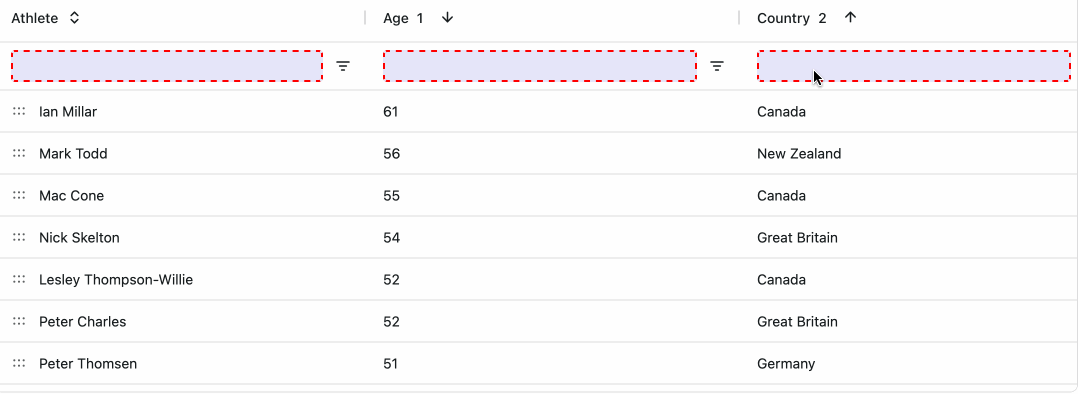
Style text inputs, checkboxes, and toggle buttons using theme parameters with withParams().
This example customizes the input background color, border, and text color:
import dash_ag_grid as dag
from dash import Dash, html
import pandas as pd

app = Dash()

df = pd.read_csv(
    "https://raw.githubusercontent.com/plotly/datasets/master/ag-grid/olympic-winners.csv"
)

columnDefs = [
    {"field": "athlete"},
    {"field": "age"},
    {"field": "country"},
    {"field": "year"},
]

app.layout = html.Div(
    [
        dag.AgGrid(
            id="styling-inputs-text-inputs",
            rowData=df.to_dict("records"),
            columnDefs=columnDefs,
            defaultColDef={"filter": True, "floatingFilter": True},
            dashGridOptions={
                "theme": {
                    "function": """themeQuartz.withParams({
                        inputBackgroundColor: 'lavender',
                        inputBorder: { color: 'red', style: 'dashed', width: 2 },
                        inputTextColor: 'black',
                    })"""
                }
            },
            columnSize="sizeToFit",
        )
    ]
)

if __name__ == "__main__":
    app.run(debug=True)
For a full list of available parameters for inputs, checkboxes, toggle buttons, and other widgets, see Theming Widgets in the AG Grid docs or explore the AG Grid Theme Builder.
Using Legacy Theming
When using legacy theming, use CSS variables such as --ag-input-*, --ag-checkbox-*, and --ag-toggle-button-*. See Customising Widgets in the AG Grid docs for a full list.