 Styling Color and Font
You can customize the colors and fonts of the built-in themes. Use withParams() on a built-in theme with the parameters you want to change:
dashGridOptions={
    "theme": {"function": "themeQuartz.withParams({accentColor: 'red', fontFamily: 'Georgia'})"}
}
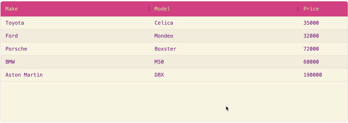
This example customizes the Quartz theme with custom colors for the background, headers, and text, along with a monospace font:
import dash_ag_grid as dag
from dash import Dash, html

app = Dash()

columnDefs = [{"field": "make"}, {"field": "model"}, {"field": "price"}]

rowData = [
    {"make": "Toyota", "model": "Celica", "price": 35000},
    {"make": "Ford", "model": "Mondeo", "price": 32000},
    {"make": "Porsche", "model": "Boxster", "price": 72000},
    {"make": "BMW", "model": "M50", "price": 60000},
    {"make": "Aston Martin", "model": "DBX", "price": 190000},
]

app.layout = html.Div(
    [
        dag.AgGrid(
            id="styling-fonts-colors",
            columnDefs=columnDefs,
            rowData=rowData,
            columnSize="sizeToFit",
            dashGridOptions={
                "theme": {
                    "function": """themeQuartz.withParams({
                        foregroundColor: 'rgb(126, 46, 132)',
                        backgroundColor: 'rgb(249, 245, 227)',
                        headerTextColor: 'rgb(204, 245, 172)',
                        headerBackgroundColor: 'rgb(209, 64, 129)',
                        oddRowBackgroundColor: 'rgba(0, 0, 0, 0.03)',
                        headerColumnResizeHandleColor: 'rgb(126, 46, 132)',
                        fontSize: 17,
                        fontFamily: 'monospace'
                    })"""
                }
            },
        ),
    ],
)

if __name__ == "__main__":
    app.run(debug=True)
Common Color and Font Parameters
| Parameter | Description |
|---|---|
accentColor |
The ‘brand color’ for the grid, used wherever a non-neutral color is required. Selections, focus outlines and checkboxes use the accent color by default. |
foregroundColor |
Default color for neutral UI elements. |
backgroundColor |
Background color of the grid. |
headerTextColor |
Color of text in the header. |
headerBackgroundColor |
Background color for header and header-like elements. |
oddRowBackgroundColor |
Background color applied to every other row. |
rowHoverColor |
Background color when hovering over rows in the grid and in dropdown menus. |
borderColor |
Default color for borders. |
cellTextColor |
Color of text in grid cells. |
fontSize |
Default font size for text in the grid. |
fontFamily |
Font family used for all text. |
Using Legacy Theming
When using legacy theming, use --ag-*-color, --ag-font-size, and --ag-font-family CSS variables to customize fonts and colors. See Customising Colors in the AG Grid docs for additional details.