 Cell Renderer Components
By default the grid renders values in the cells as strings. If you want something more complex you can use a cell renderer. The cellRenderer property accepts a function and allows you to provide your own cell renderer component.
See the AG Grid documentation for complete information on cell renderer components.
Value Formatter vs Cell Renderer
With a cell renderer you can add any HTML you want to a cell. This is similar to value formatters, but they have different uses. Value formatters are for text formatting and cell renderers are for when you want to include HTML markup and potentially functionality to the cell.
For example, if you want to put punctuation into a value, use a value formatter, but if you want to put buttons or HTML links, use a cell renderer. It is also possible to use a combination of both. In this case, the result of the value formatter will be passed to the cell renderer.
Markdown Component vs Cell Renderer
The
import dash_ag_grid as dag
from dash import Dash, html, dcc
import pandas as pd

data = {
    "ticker": ["AAPL", "MSFT", "AMZN", "GOOGL"],
    "company": ["Apple", "Microsoft", "Amazon", "Alphabet"],
    "quantity": [75, 40, 100, 50],
}
df = pd.DataFrame(data)

columnDefs = [
    {
        "headerName": "Stock Ticker",
        "field": "ticker",
        # stockLink function is defined in the dashAgGridComponentFunctions.js in assets folder
        "cellRenderer": "StockLink",
    },
    {
        "headerName": "Company",
        "field": "company",
    },
    {
        "headerName": "Shares",
        "field": "quantity",
        "editable": True,
    },
]


grid = dag.AgGrid(
    id="simple-column-example-1",
    columnDefs=columnDefs,
    rowData=df.to_dict("records"),
    columnSize="sizeToFit"
)


app = Dash()

app.layout = html.Div([dcc.Markdown("Adding links with cellRenderer"), grid])

if __name__ == "__main__":
    app.run(debug=True)


"""
Put the following in the dashAgGridComponentFunctions.js file in the assets folder

-----------
var dagcomponentfuncs = (window.dashAgGridComponentFunctions = window.dashAgGridComponentFunctions || {});

dagcomponentfuncs.StockLink = function (props) {
    return React.createElement(
        'a',
        {href: 'https://finance.yahoo.com/quote/' + props.value},
        props.value
    );
};

"""
Adding links with cellRenderer
Dash Callbacks with cellRenderer Components
To use the custom cellRenderer components in a callback, the component must call the setData() function, which will update the Dash prop cellRendererData. Use this prop to get information on which component triggered the callback.
cellRendererData (dict; optional): Special prop to allow feedback from cell renderer to the grid. cellRendererData is a dict with keys:
-
colId(string; optional): Column ID from where the event was fired. -
rowId(boolean | number | string | dict | list; optional): Row Id from the grid, this could be a number automatically, or set via getRowId. -
rowIndex(number; optional): Row Index from the grid, this is associated with the row count. -
timestamp(boolean | number | string | dict | list; optional): Timestamp of when the event was fired. -
value(boolean | number | string | dict | list; optional): Value set from the function.
Update the cellRendererData prop in the custom component by calling the setData() function.
You may also include arbitrary data which will be included in the value key, for example: setData(<myData>)
Example 2: Button Component with Callback
This example shows how to add HTML buttons to cells in the grid and use the cellRendererData prop in the callback to see which button triggered the callback.
Note the following:
- The button component is defined as Button in the dashAgGridComponentFunctions.js file in the assets folder.
- cellRendererData prop is updated by calling setData() in the component
- The cellRendererData prop is used as an Input of a Dash callback, and it contains information on which button was clicked.
- The HTML button is styled with Bootstrap class names passed to the component in the cellRendererParams prop from the Dash app.
import json
import dash_ag_grid as dag
from dash import Dash, html, dcc, Input, Output, callback
import pandas as pd
import dash_bootstrap_components as dbc


data = {
    "ticker": ["AAPL", "MSFT", "AMZN", "GOOGL"],
    "company": ["Apple", "Microsoft", "Amazon", "Alphabet"],
    "price": [154.99, 268.65, 100.47, 96.75],
    "buy": ["Buy" for i in range(4)],
}
df = pd.DataFrame(data)

columnDefs = [
    {
        "headerName": "Stock Ticker",
        "field": "ticker",
    },
    {"headerName": "Company", "field": "company", "filter": True},
    {
        "headerName": "Last Close Price",
        "type": "rightAligned",
        "field": "price",
        "valueFormatter": {"function": """d3.format("($,.2f")(params.value)"""},
    },
    {
        "field": "buy",
        "cellRenderer": "Button",
        "cellRendererParams": {"className": "btn btn-success"},
    },
]


grid = dag.AgGrid(
    id="custom-component-btn-grid",
    columnDefs=columnDefs,
    rowData=df.to_dict("records"),
    columnSize="autoSize",
    dashGridOptions={"rowHeight": 48},
)


app = Dash(__name__, external_stylesheets=[dbc.themes.SPACELAB])

app.layout = html.Div(
    [
        dcc.Markdown("Example of cellRenderer with custom button component"),
        grid,
        html.Div(id="custom-component-btn-value-changed"),
    ]
)


@callback(
    Output("custom-component-btn-value-changed", "children"),
    Input("custom-component-btn-grid", "cellRendererData"),
)
def showChange(n):
    return json.dumps(n)


if __name__ == "__main__":
    app.run(debug=True)


"""
Put the following in the dashAgGridComponentFunctions.js file in the assets folder

---------------

var dagcomponentfuncs = window.dashAgGridComponentFunctions = window.dashAgGridComponentFunctions || {};

dagcomponentfuncs.Button = function (props) {
    const {setData, data} = props;

    function onClick() {
        setData();
    }
    return React.createElement(
        'button',
        {
            onClick: onClick,
            className: props.className,
        },
        props.value
    );
};

"""
Example of cellRenderer with custom button component
Using Other Component Libraries
It’s possible to make custom components for use with the cellRenderer using any of the component modules you have imported in your Dash app. In this section we will show how to add the following components:
- Button from Dash Bootstrap Components
- Graph from Dash Core Components
- Button from Dash Mantine Components
- Icons from Dash Iconify
Example 3: Cell Renderer with dbc.Button
This is the same app as Example 2 above, except instead of creating an HTML button, we’ll use the Button component from the dash-bootstrap-components library.
Since we have imported dash_bootstrap_components in our app, we can access the dbc.Button component like this:
window.dash_bootstrap_components.Button
You can make a custom component with React.createElement with a dbc.Button instead of a regular HTML Button like this:
React.createElement(window.dash_bootstrap_components.Button, {dbc.Button props}, children)
Note the following:
- The button is defined as DBC_Button_Simple in the dashAgGridComponentFunctions.js file in the assets folder.
- The callback works the same way as the button in Example 2
- The button is styled with the dbc.Button component’s color prop, and is passed to the component in the
cellRendererParams prop from the Dash app.
import json
import dash_ag_grid as dag
from dash import Dash, html, dcc, Input, Output, callback
import pandas as pd
import dash_bootstrap_components as dbc


data = {
    "ticker": ["AAPL", "MSFT", "AMZN", "GOOGL"],
    "company": ["Apple", "Microsoft", "Amazon", "Alphabet"],
    "price": [154.99, 268.65, 100.47, 96.75],
    "buy": ["Buy" for i in range(4)],
}
df = pd.DataFrame(data)

columnDefs = [
    {
        "headerName": "Stock Ticker",
        "field": "ticker",
    },
    {"headerName": "Company", "field": "company"},
    {
        "headerName": "Last Close Price",
        "type": "rightAligned",
        "field": "price",
        "valueFormatter": {"function": """d3.format("($,.2f")(params.value)"""},
    },
    {
        "field": "buy",
        "cellRenderer": "DBC_Button_Simple",
        "cellRendererParams": {"color": "success"},
    },
]


grid = dag.AgGrid(
    id="dbc-btn-simple-btn-grid",
    columnDefs=columnDefs,
    rowData=df.to_dict("records"),
    columnSize="autoSize",
    dashGridOptions={"rowHeight": 48},
)


app = Dash(__name__, external_stylesheets=[dbc.themes.SPACELAB])

app.layout = html.Div(
    [
        dcc.Markdown("Example of cellRenderer with custom dash-bootstrap-components Button "),
        grid,
        html.Div(id="dbc-btn-simple-value-changed"),
    ]
)


@callback(
    Output("dbc-btn-simple-value-changed", "children"),
    Input("dbc-btn-simple-btn-grid", "cellRendererData"),
)
def showChange(n):
    return json.dumps(n)


if __name__ == "__main__":
    app.run(debug=True)


"""
Put the following in the dashAgGridComponentFunctions.js file in the assets folder

---------------

var dagcomponentfuncs = window.dashAgGridComponentFunctions = window.dashAgGridComponentFunctions || {};

dagcomponentfuncs.DBC_Button_Simple = function (props) {
    const {setData, data} = props;

    function onClick() {
        setData();
    }
    return React.createElement(
        window.dash_bootstrap_components.Button,
        {
            onClick,
            color: props.color,
        },
        props.value
    );
};


"""
Example of cellRenderer with custom dash-bootstrap-components Button
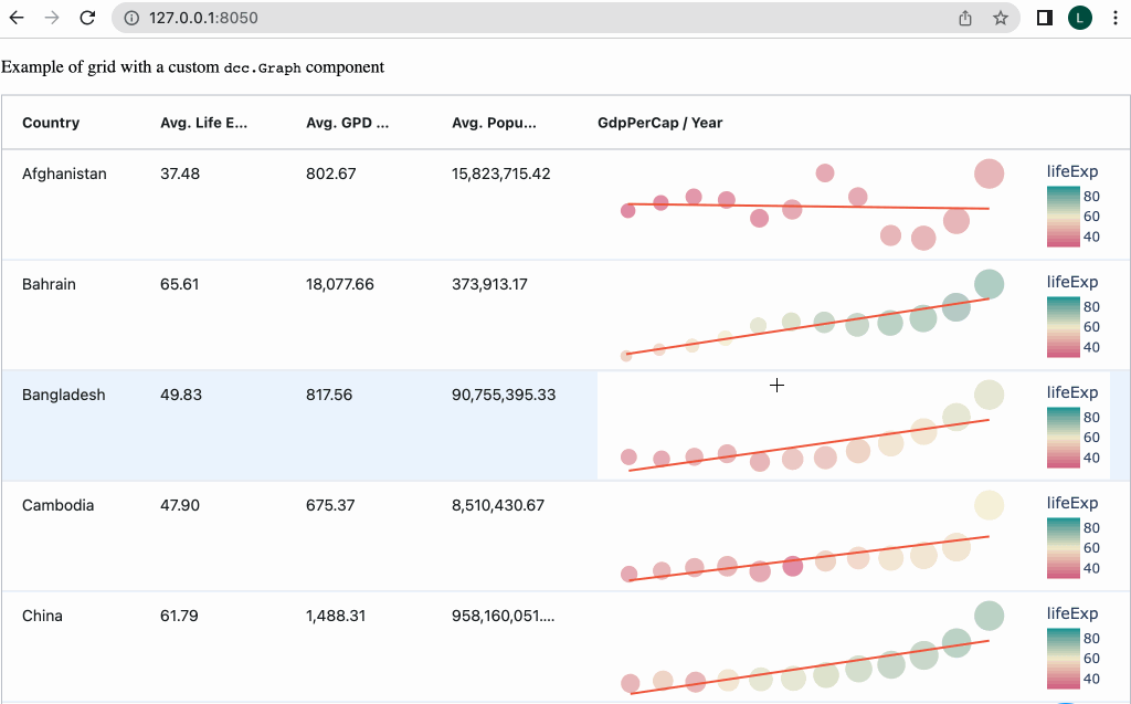
Example 4: Cell Renderer with dcc.Graph
In this example we will render a plotly figure in a custom dcc.Graph component in the grid. Since we have imported dash_core_components in our app, we can access the dcc.Graph component like this:
window.dash_core_components.Graph
So now we can make a component with React.createElement with dcc.Graph like this:
React.createElement(window.dash_core_components.Graph, {dcc.Graph props}, children)
In the example below note the following:
- The graph component is defined as DCC_GraphClickData in the dashAgGridComponentFunctions.js file in the assets folder
- cellRendererData prop is updated by calling setData() with the clickData in the figure.
- The figure is a plotly figure from the “graph” column of the dataframe.
import dash_ag_grid as dag
from dash import Dash, Input, Output, html, dcc, callback
import plotly.express as px
import json


app = Dash()

df = px.data.gapminder().query('continent == "Asia"')
df2 = df.groupby("country")[["lifeExp", "gdpPercap", "pop"]].mean().reset_index()

df2["graph"] = ""
for i, r in df2.iterrows():
    filterDf = df[df["country"] == r["country"]]
    fig = px.scatter(
        filterDf,
        x="year",
        y="gdpPercap",
        size="pop",
        color="lifeExp",
        color_continuous_scale=px.colors.diverging.Tealrose_r,
        trendline="ols",
        range_color=[30, 90],
    )
    fig.update_layout(
        showlegend=False,
        yaxis_visible=False,
        yaxis_showticklabels=False,
        xaxis_visible=False,
        xaxis_showticklabels=False,
        margin=dict(l=0, r=0, t=0, b=0),
        template="plotly_white",
    )
    df2.at[i, "graph"] = fig

columnDefs = [
    {"field": "country"},
    {
        "field": "lifeExp",
        "headerName": "Avg. Life Expectancy",
        "valueFormatter": {"function": 'd3.format("(,.2f")(params.value)'},
    },
    {
        "field": "gdpPercap",
        "headerName": "Avg. GPD per Capita",
        "valueFormatter": {"function": 'd3.format("(,.2f")(params.value)'},
    },
    {
        "field": "pop",
        "headerName": "Avg. Population",
        "valueFormatter": {"function": 'd3.format("(,.2f")(params.value)'},
    },
    {
        "field": "graph",
        "cellRenderer": "DCC_GraphClickData",
        "headerName": "GdpPerCap / Year",
        "maxWidth": 900,
        "minWidth": 500,
    }
]


app.layout = html.Div(
    [
        dcc.Markdown("Example of grid with a custom `dcc.Graph` component"),
        dag.AgGrid(
            id="custom-component-graph-grid",
            rowData=df2.to_dict("records"),
            columnSize="sizeToFit",
            columnDefs=columnDefs,
            defaultColDef={"filter": True, "minWidth": 125},
            dashGridOptions={"rowHeight": 100, "animateRows": False},
            style={"height": 800},
        ),
        html.Div(id="custom-component-graph-output"),
    ]
)


@callback(
    Output("custom-component-graph-output", "children"),
    Input("custom-component-graph-grid", "cellRendererData")
)
def graphClickData(d):
    return json.dumps(d)


if __name__ == "__main__":
    app.run(debug=True)


"""
Put the following in the dashAgGridComponentFunctions.js file in the assets folder

---------------

var dagcomponentfuncs = window.dashAgGridComponentFunctions = window.dashAgGridComponentFunctions || {};

dagcomponentfuncs.DCC_GraphClickData = function (props) {
    const {setData} = props;
    function setProps() {
        const graphProps = arguments[0];
        if (graphProps['clickData']) {
            setData(graphProps);
        }
    }
    return React.createElement(window.dash_core_components.Graph, {
        figure: props.value,
        setProps,
        style: {height: '100%'},
        config: {displayModeBar: false},
    });
};
"""
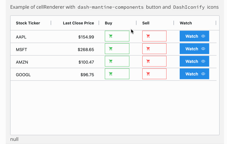
Example 5: Cell Render with dmc.Button with DashIconify icons.
This example is similar to Example 3 and 4, but uses the Dash Mantine Components and Dash Iconify libraries.
In this example, note the following:
- The button is defined as DMC_Button in the dashAgGridComponentFunctions.js file in the assets folder.
- All three buttons use the same component, and are customized for the color, icons, etc by passing props to the component using the
cellRendererParams prop.
import json
import dash_ag_grid as dag
from dash import Dash, html, dcc, Input, Output, callback
import pandas as pd
import dash_mantine_components as dmc
import dash_iconify


data = {
    "ticker": ["AAPL", "MSFT", "AMZN", "GOOGL"],
    "price": [154.99, 268.65, 100.47, 96.75],
    "buy": ["Buy" for _ in range(4)],
    "sell": ["Sell" for _ in range(4)],
    "watch": ["Watch" for _ in range(4)],
}
df = pd.DataFrame(data)

columnDefs = [
    {
        "headerName": "Stock Ticker",
        "field": "ticker",
    },
    {
        "headerName": "Last Close Price",
        "type": "rightAligned",
        "field": "price",
        "valueFormatter": {"function": """d3.format("($,.2f")(params.value)"""},
    },
    {
        "field": "buy",
        "cellRenderer": "DMC_Button",
        "cellRendererParams": {
            "variant": "outline",
            "leftIcon": "ic:baseline-shopping-cart",
            "color": "green",
            "radius": "xl"
        },
    },
    {
        "field": "sell",
        "cellRenderer": "DMC_Button",
        "cellRendererParams": {
            "variant": "outline",
            "leftIcon": "ic:baseline-shopping-cart",
            "color": "red",
            "radius": "xl"
        },
    },
    {
        "field": "watch",
        "cellRenderer": "DMC_Button",
        "cellRendererParams": {
            "rightIcon": "ph:eye",
        },
    },
]


grid = dag.AgGrid(
    id="custom-component-dmc-btn-grid",
    columnDefs=columnDefs,
    rowData=df.to_dict("records"),
    columnSize="autoSize",
    defaultColDef={"minWidth": 125}
)


app = Dash()

# The app layout must be wrapped with dmc.MantineProvider for the DMC_Button component to work
app.layout = dmc.MantineProvider(
    html.Div(
        [
            dcc.Markdown("Example of cellRenderer with `dash-mantine-components` button  and `DashIconify` icons"),
            grid,
            html.Div(id="custom-component-dmc-btn-value-changed"),
        ]
    )
)


@callback(
    Output("custom-component-dmc-btn-value-changed", "children"),
    Input("custom-component-dmc-btn-grid", "cellRendererData"),
)
def showChange(n):
    return json.dumps(n)


if __name__ == "__main__":
    app.run(debug=True)


"""
Put the following in the dashAgGridComponentFunctions.js file in the assets folder

---------------

var dagcomponentfuncs = window.dashAgGridComponentFunctions = window.dashAgGridComponentFunctions || {};

// Note: The app layout must be wrapped with dmc.MantineProvider for this component to work
dagcomponentfuncs.DMC_Button = function (props) {
    const {setData, data} = props;

    function onClick() {
        setData();
    }
    let leftIcon, rightIcon;
    if (props.leftIcon) {
        leftIcon = React.createElement(window.dash_iconify.DashIconify, {
            icon: props.leftIcon,
        });
    }
    if (props.rightIcon) {
        rightIcon = React.createElement(window.dash_iconify.DashIconify, {
            icon: props.rightIcon,
        });
    }
    return React.createElement(
        window.dash_mantine_components.Button,
        {
            onClick,
            variant: props.variant,
            color: props.color,
            leftSection: leftIcon,
            rightSection: rightIcon,
            radius: props.radius,
            style: {
                margin: props.margin,
                display: 'flex',
                justifyContent: 'center',
                alignItems: 'center',
            },
        },
        props.value
    );
};


"""
Example 6: Including extra data in cellRenderData
Note that as of Dash AG Grid V31.0.0, there are 7 Provided Cell Editors, including a Checkbox Cell Editor.
This example shows how to pass extra data from a custom component to Dash for use in a callback. We pass the state of
the checkbox to the value key of the cellRendererData prop. We do this by calling the function setData(checked) in the component.
Compare the data in the callback in this example to the Button example above. You will see that the in the Button example,
there is no value key in the cellRendererData.
import json
import dash_ag_grid as dag
from dash import Dash, html, dcc, Input, Output, callback
import pandas as pd
import dash_bootstrap_components as dbc


data = {
    "ticker": ["AAPL", "MSFT", "AMZN", "GOOGL"],
    "company": ["Apple", "Microsoft", "Amazon", "Alphabet"],
    "price": [154.99, 268.65, 100.47, 96.75],
    "binary": [False, True, False, False],

}
df = pd.DataFrame(data)

columnDefs = [
    {
        "headerName": "Stock Ticker",
        "field": "ticker",
    },
    {"headerName": "Company", "field": "company", "filter": True},
    {
        "headerName": "Last Close Price",
        "type": "rightAligned",
        "field": "price",
        "valueFormatter": {"function": """d3.format("($,.2f")(params.value)"""},
        "editable": True,
    },
    {
        "field": "binary",
        "cellRenderer": "Checkbox",
    },
]


grid = dag.AgGrid(
    id="custom-component-checkbox-grid",
    columnDefs=columnDefs,
    rowData=df.to_dict("records"),
    columnSize="autoSize"
)


app = Dash(__name__, external_stylesheets=[dbc.themes.SPACELAB])

app.layout = html.Div(
    [
        dcc.Markdown("Example of cellRenderer with custom checkbox component"),
        grid,
        html.Div(id="custom-component-checkbox-value-changed"),
        html.Div(id="x")
    ]
)


@callback(
    Output("custom-component-checkbox-value-changed", "children"),
    Input("custom-component-checkbox-grid", "cellRendererData"),
)
def show_change(n):
    return json.dumps(n)


if __name__ == "__main__":
    app.run(debug=True)


"""
Put the following in the dashAgGridComponentFunctions.js file in the assets folder


---------------

var dagcomponentfuncs = window.dashAgGridComponentFunctions = window.dashAgGridComponentFunctions || {};


// custom component to display boolean data as a checkbox
dagcomponentfuncs.Checkbox = function (props) {
    const {setData, data} = props;
    function onClick() {
        if (!('checked' in event.target)) {
            const checked = !event.target.children[0].checked;
            const colId = props.column.colId;
            props.node.setDataValue(colId, checked);
        }
    }
    function checkedHandler() {
        // update grid data
        const checked = event.target.checked;
        const colId = props.column.colId;
        props.node.setDataValue(colId, checked);
        // update cellRendererData prop so it can be used to trigger a callback
        setData(checked);
    }
    return React.createElement(
        'div',
        {onClick: onClick},
        React.createElement('input', {
            type: 'checkbox',
            checked: props.value,
            onChange: checkedHandler,
            style: {cursor: 'pointer'},
        })
    );
};

"""
Example of cellRenderer with custom checkbox component
Example 7: Custom Image Component
This example is another simple example of creating a custom component with data passed back to Dash in the callback.
The ImgThumbnail custom component renders an img HTML tag and uses the cell value in the src attribute. The CSS in the style makes the image responsive. The size of the image is determined by the column width and row height of the grid.
React.createElement(
    'img',
    {
        src: props.value,
        onClick: onClick,
        style: {width: '100%', height: 'auto'},

    },
)
The onClick is a function that calls setData(props.value). This adds the cell value (the img URL) to the cellRendererData prop, making it easy to use in a Dash callback.
function onClick() {
    setData(props.value);
}
Here is the Dash callback that renders a fullsize image in a modal component when you click on the Thumbnail:
@callback(
    Output("custom-component-img-modal", "is_open"),
    Output("custom-component-img-modal", "children"),
    Input("custom-component-img-grid", "cellRendererData"),
)
def show_change(data):
    if data:
        return True, html.Img(src=data["value"])
    return False, None
import dash_ag_grid as dag
from dash import Dash, html, dcc, Input, Output, callback
import pandas as pd
import dash_bootstrap_components as dbc

webb_stephans_quintet = "https://user-images.githubusercontent.com/72614349/179115663-71578706-1ab5-45a5-b809-812c7c3028a7.jpg"
webb_deep_field = "https://user-images.githubusercontent.com/72614349/179115668-2630e3e4-3a9f-4c88-9494-3412e606450a.jpg"
webb_southern_nebula = "https://user-images.githubusercontent.com/72614349/179115670-ef5bc561-d957-4e88-82dc-53ca53541b04.jpg"
webb_carina = "https://user-images.githubusercontent.com/72614349/179115673-15eaccb9-d17d-4667-84fb-e0a46fd444e8.jpg"


data_dict = {
    "name": ["Deep Field", "Southern Nebula", "Stephans Quintet", "Carina Nebula"],
    "img": [webb_deep_field, webb_southern_nebula, webb_stephans_quintet, webb_carina],
    "more_info": [
        "[James Webb Space Telescope First Images](https://www.nasa.gov/image-feature/goddard/2022/nasa-s-webb-delivers-deepest-infrared-image-of-universe-yet)",
        "[JWST - A dying star](https://www.nasa.gov/image-feature/goddard/2022/nasa-s-webb-captures-dying-star-s-final-performance-in-fine-detail)",
        "[JWST - Galaxy evolution and black holes](https://www.nasa.gov/image-feature/goddard/2022/nasa-s-webb-sheds-light-on-galaxy-evolution-black-holes)",
        "[JWST - Birth of a star](https://www.nasa.gov/image-feature/goddard/2022/nasa-s-webb-reveals-cosmic-cliffs-glittering-landscape-of-star-birth)",
    ],
}
df = pd.DataFrame(data_dict)

columnDefs = [
    {
        "headerName": "Thumbnail",
        "field": "img",
        "cellRenderer": "ImgThumbnail",
        "width": 100,
    },
    {
        "headerName": "Image Name",
        "field": "name",
    },
    {"headerName": "More Info", "field": "more_info", "cellRenderer": "markdown"},
]


grid = dag.AgGrid(
    id="custom-component-img-grid",
    columnDefs=columnDefs,
    rowData=df.to_dict("records"),
    dashGridOptions={"rowHeight": 100},
    style={"height": 475},
    columnSize="sizeToFit",
)


app = Dash(__name__, external_stylesheets=[dbc.themes.SPACELAB])

app.layout = html.Div(
    [
        dcc.Markdown(
            "Example of cellRenderer with custom Image component. Click on Thumbnail to see full size Image"
        ),
        grid,
        dbc.Modal(id="custom-component-img-modal", size="xl"),
    ]
)


@callback(
    Output("custom-component-img-modal", "is_open"),
    Output("custom-component-img-modal", "children"),
    Input("custom-component-img-grid", "cellRendererData"),
)
def show_change(data):
    if data:
        return True, html.Img(src=data["value"])
    return False, None


if __name__ == "__main__":
    app.run(debug=True)


"""
Put the following in the dashAgGridComponentFunctions.js file in the assets folder


---------------

var dagcomponentfuncs = window.dashAgGridComponentFunctions = window.dashAgGridComponentFunctions || {};


dagcomponentfuncs.ImgThumbnail = function (props) {
    const {setData, data} = props;

    function onClick() {
        setData(props.value);
    }

    return React.createElement(
        'div',
        {
            style: {
                width: '100%',
                height: '100%',
                display: 'flex',
                alignItems: 'center',
            },
        },
        React.createElement(
            'img',
            {
                onClick,
                style: {width: '100%', height: 'auto'},
                src: props.value,

            },
        )
    );
};

"""
Example of cellRenderer with custom Image component. Click on Thumbnail to see full size Image