 dcc.DatePickerSingle
dcc.DatePickerSingle is a component for rendering a calendar from which the user can select a date.
You can use either strings in the form YYYY-MM-DD or date objects from the datetime module to provide dates to Dash components. Strings are preferred because that’s the form dates take as callback arguments. If you are using date objects, we recommend using datetime.date so there is no time part. dcc.DatePickerSingle accepts dates with a time part, but this can be confusing, particularly for the initial call of a callback. After the user chooses a new date, there will be no time part—only the date. If you already have a datetime.datetime object, you can convert it with date().
Month and Display Format
The month_format property determines how calendar headers are displayed when the calendar is opened.
The display_format property determines how selected dates are displayed in the dcc.DatePickerSingle component.
Both of these properties are configured through strings that use a combination of any of the following tokens.
| String Token | Example | Description |
|---|---|---|
YYYY |
2014 |
4 or 2 digit year |
YY |
14 |
2 digit year |
Y |
-25 |
Year with any number of digits and sign |
Q |
1..4 |
Quarter of year. Sets month to first month in quarter. |
M MM |
1..12 |
Month number |
MMM MMMM |
Jan..December |
Month name |
D DD |
1..31 |
Day of month |
| Do | 1st..31st |
Day of month with ordinal |
DDD DDDD |
1..365 |
Day of year |
X |
1410715640.579 |
Unix timestamp |
x |
1410715640579 |
Unix ms timestamp |
Examples
Find a few usage examples below.
Simple DatePickerSingle Example
This is a simple example of a dcc.DatePickerSingle component tied to a callback.
The min_date_allowed and max_date_allowed properties define the minimum and maximum selectable dates on the calendar while initial_visible_month defines the calendar month that is first displayed when the dcc.DatePickerSingle component is opened.
from dash import Dash, html, dcc, Input, Output, callback

from datetime import date

app = Dash()
app.layout = html.Div([
    dcc.DatePickerSingle(
        id='my-date-picker-single',
        min_date_allowed=date(1995, 8, 5),
        max_date_allowed=date(2017, 9, 19),
        initial_visible_month=date(2017, 8, 5),
        date=date(2017, 8, 25)
    ),
    html.Div(id='output-container-date-picker-single')
])


@callback(
    Output('output-container-date-picker-single', 'children'),
    Input('my-date-picker-single', 'date'))
def update_output(date_value):
    string_prefix = 'You have selected: '
    if date_value is not None:
        date_object = date.fromisoformat(date_value)
        date_string = date_object.strftime('%B %d, %Y')
        return string_prefix + date_string


if __name__ == '__main__':
    app.run(debug=True)
Month Format Examples
You can set month_format to any permutation of the string tokens shown in Month and Display Format above to change how calendar titles are displayed in the dcc.DatePickerSingle component.
from dash import dcc
from datetime import date

dcc.DatePickerSingle(
    month_format='MMM Do, YY',
    placeholder='MMM Do, YY',
    date=date(2017, 6, 21)
)
from dash import dcc
from datetime import date

dcc.DatePickerSingle(
    month_format='M-D-Y-Q',
    placeholder='M-D-Y-Q',
    date=date(2017, 6, 21)
)
from dash import dcc
from datetime import date

dcc.DatePickerSingle(
    month_format='MMMM Y',
    placeholder='MMMM Y',
    date=date(2020, 2, 29)
)
from dash import dcc
from datetime import date

dcc.DatePickerSingle(
    month_format='X',
    placeholder='X',
    date=date(2017, 6, 21)
)
Display Format Examples
You can use any permutation of the string tokens shown in Month and Display Format above to change how selected dates are displayed in the dcc.DatePickerSingle component.
from dash import dcc

dcc.DatePickerSingle(
    date='2017-06-21',
    display_format='MMM Do, YY'
)
from dash import dcc
from datetime import date

dcc.DatePickerSingle(
    date=date(2017, 6, 21),
    display_format='M-D-Y-Q',
)
from dash import dcc
from datetime import date

dcc.DatePickerSingle(
    date=date(2017, 6, 21),
    display_format='MMMM Y, DD'
)
from dash import dcc
from datetime import date

dcc.DatePickerSingle(
    date=date(2017, 6, 21),
    display_format='X',
)
Vertical Calendar and Placeholder Text
The dcc.DatePickerSingle component can be rendered in two orientations, either horizontally or vertically. If calendar_orientation is set to 'vertical', it will be rendered vertically and will default to 'horizontal' if not defined.
The placeholder defines the grey default text defined in the calendar input boxes when no date is selected.
from dash import dcc
from datetime import date

dcc.DatePickerSingle(
    calendar_orientation='vertical',
    placeholder='Select a date',
    date=date(2017, 6, 21)
)
Calendar Clear and Portals
When the clearable property is set to True the component will be rendered with a small x that will remove all selected dates when selected.
The dcc.DatePickerSingle component supports two different portal types, one being a full screen portal (with_full_screen_portal) and another being a simple screen overlay, like the one shown below (with_portal).
from dash import dcc
from datetime import date

dcc.DatePickerSingle(
    clearable=True,
    with_portal=True,
    date=date(2017, 6, 21)
)
Right To Left Calendars and First Day of Week
When the is_RTL property is set to True the calendar will be rendered from right to left.
The first_day_of_week property allows you to define which day of the week will be set as the first day of the week. In the example below, Tuesday is the first day of the week.
from dash import dcc
from datetime import date

dcc.DatePickerSingle(
    is_RTL=True,
    first_day_of_week=3,
    date=date(2017, 6, 21)
)
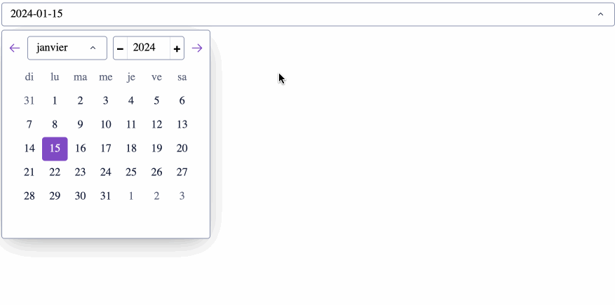
Calendar Translations
New in Dash 4.0
You can change the calendar language by adding a date-fns translations script using external_scripts on the Dash app constructor or by adding the script to the assets folder. The following example adds the French translation.
from dash import Dash, dcc, html
from datetime import datetime

external_scripts = [
    'https://cdn.jsdelivr.net/npm/date-fns@4.1.0/locale/fr/cdn.min.js'
]

app = Dash(__name__, external_scripts=external_scripts)

app.layout = html.Div([
    dcc.DatePickerSingle(
        date=datetime(2024, 1, 15)
    )
])

if __name__ == '__main__':
    app.run(debug=True)
Language Matching
The DatePickerSingle component matches the supplied translations with the app user’s browser language:
- If you include just one translation, all app users see that language. For example, the earlier example includes just French translations, so all app users will see a French calendar.
- If you include multiple translations, the first language provided is the one app users will see, unless that user’s preferred browser language is one of the other included languages. For example, if the app includes:
external_scripts = [
      'https://cdn.jsdelivr.net/npm/date-fns@4.1.0/locale/fr/cdn.min.js',
      'https://cdn.jsdelivr.net/npm/date-fns@4.1.0/locale/en/cdn.min.js'
  ]
all app users will see a French calendar except those whose preferred browser language is English.
- If you include no translations, all app users see English (the default).
See the date-fns CDN documentation on GitHub for more information and the locale directory for available locales.
You can also include all language translations instead of scripts for specific ones using the following script: https://cdnjs.cloudflare.com/ajax/libs/date-fns/4.1.0/locale/cdn.min.js.
DatePickerSingle Properties
Access this documentation in your Python terminal with:
```pythonhelp(dash.dcc.DatePickerSingle)
```
Our recommended IDE for writing Dash apps is Dash Enterprise’s
Data Science Workspaces,
which has typeahead support for Dash Component Properties.
Find out if your company is using
Dash Enterprise.
date (boolean | number | string | list | dict; optional):
Specifies the starting date for the component, best practice is to
pass value via datetime object.
min_date_allowed (string; optional):
Specifies the lowest selectable date for the component. Accepts
datetime.datetime objects or strings in the format ‘YYYY-MM-DD’.
max_date_allowed (string; optional):
Specifies the highest selectable date for the component. Accepts
datetime.datetime objects or strings in the format ‘YYYY-MM-DD’.
disabled_days (list of strings; optional):
Specifies additional days between min_date_allowed and
max_date_allowed that should be disabled. Accepted datetime.datetime
objects or strings in the format ‘YYYY-MM-DD’.
placeholder (string; default 'Select Date'):
Text that will be displayed in the input box of the date picker when
no date is selected.
initial_visible_month (string; optional):
Specifies the month that is initially presented when the user opens
the calendar. Accepts datetime.datetime objects or strings in the
format ‘YYYY-MM-DD’.
clearable (boolean; default False):
Whether or not the dropdown is “clearable”, that is, whether or not a
small “x” appears on the right of the dropdown that removes the
selected value.
reopen_calendar_on_clear (boolean; default False):
If True, the calendar will automatically open when cleared.
display_format (string; optional):
Specifies the format that the selected dates will be displayed valid
formats are variations of “MM YY DD”. For example: “MM YY DD” renders
as ‘05 10 97’ for May 10th 1997 “MMMM, YY” renders as ‘May, 1997’ for
May 10th 1997 “M, D, YYYY” renders as ‘07, 10, 1997’ for September
10th 1997 “MMMM” renders as ‘May’ for May 10 1997.
month_format (string; optional):
Specifies the format that the month will be displayed in the calendar,
valid formats are variations of “MM YY”. For example: “MM YY” renders
as ‘05 97’ for May 1997 “MMMM, YYYY” renders as ‘May, 1997’ for May
1997 “MMM, YY” renders as ‘Sep, 97’ for September 1997.
first_day_of_week (a value equal to: None, 0, 1, 2, 3, 4, 5 or 6; default 0):
Specifies what day is the first day of the week, values must be from
[0, …, 6] with 0 denoting Sunday and 6 denoting Saturday.
show_outside_days (boolean; default True):
If True the calendar will display days that rollover into the next
month.
stay_open_on_select (boolean; default False):
If True the calendar will not close when the user has selected a value
and will wait until the user clicks off the calendar.
calendar_orientation (a value equal to: None, ‘vertical’ or ‘horizontal’; default 'horizontal'):
Orientation of calendar, either vertical or horizontal. Valid options
are ‘vertical’ or ‘horizontal’.
number_of_months_shown (number; default 1):
Number of calendar months that are shown when calendar is opened.
with_portal (boolean; default False):
If True, calendar will open in a screen overlay portal, not supported
on vertical calendar.
with_full_screen_portal (boolean; default False):
If True, calendar will open in a full screen overlay portal, will take
precedent over ‘withPortal’ if both are set to True, not supported on
vertical calendar.
day_size (number; default 34):
Size of rendered calendar days, higher number means bigger day size
and larger calendar overall.
is_RTL (boolean; default False):
Determines whether the calendar and days operate from left to right or
from right to left.
disabled (boolean; default False):
If True, no dates can be selected.
style (boolean | number | string | list | dict; optional):
CSS styles appended to wrapper div.
className (string; optional):
Additional CSS class for the root DOM node.
persistence (string | number | boolean; optional):
Used to allow user interactions in this component to be persisted when
the component - or the page - is refreshed. If persisted is truthy
and hasn’t changed from its previous value, a value that the user
has changed while using the app will keep that change, as long as the
new value also matches what was given originally. Used in
conjunction with persistence_type.
persisted_props (boolean | number | string | list | dict; default [PersistedProps.date]):
Properties whose user interactions will persist after refreshing the
component or the page. Since only value is allowed this prop can
normally be ignored.
persistence_type (a value equal to: None, ‘local’, ‘session’ or ‘memory’; default PersistenceTypes.local):
Where persisted user changes will be stored: memory: only kept in
memory, reset on page refresh. local: window.localStorage, data is
kept after the browser quit. session: window.sessionStorage, data is
cleared once the browser quit.
id (string; optional):
The ID of this component, used to identify dash components in
callbacks. The ID needs to be unique across all of the components in
an app.
componentPath (boolean | number | string | list | dict; optional)